Words have a way of swaying people, but only if done right. In the age of social media, the right words can result in success, and that’s why calls to action, or CTAs, can make or break your campaigns.
CTAs are like friendly nudges that guide people toward the desired outcome. They provide clear directions, telling your audience what they should do next. Without a compelling CTA, visitors to your website or readers of your content may feel lost or unsure about what steps to take.
The beauty of a well-crafted call to action lies in its simplicity and effectiveness. By using persuasive language, highlighting benefits, and creating a sense of urgency, you can inspire people to take action in a natural and engaging way.
Whether you want to boost sales, increase engagement, or grow your email list, CTAs can be your secret weapon. In this blog, we will delve into what CTAs are, the different types that exist, and how to create a compelling one for your social media platforms!
But first, let’s dive in and explore some basics!
What is a Call-to-Action (CTA)?
Have you ever received a message that urged you to “Sign up now!” or “Buy today and get 50% off!”? Well, those are examples of CTAs in action. A call to action is a phrase or button that prompts or encourages someone to take a specific action. It is a clear invitation or instruction to engage with a product, service, or content.
The purpose of a CTA is to guide and motivate individuals toward a desired goal, such as making a purchase, subscribing to a newsletter, downloading an e-book, or following a social media account.
CTAs are commonly used in various marketing channels, including websites, emails, advertisements, social media posts, and landing pages. They are designed to capture the audience’s attention and compel them to act. They often create a sense of urgency or highlight the benefits you will receive by taking the suggested action.
A well-crafted CTA typically includes action-oriented words, such as “buy,” “subscribe,” “download,” or “learn,” and may use techniques like contrasting colors, placing CTAs strategically on a webpage, or employing eye-catching design elements.
Now that you understand what a CTA is, let’s explore the different types of CTAs you can use to drive action and achieve specific marketing goals.
Check these: The Best Newsletter CTA Formulas (That Actually Get Clicked)
Understanding the Various Types of CTAs
There’s no one-size-fits-all when it comes to CTAs. Maybe you’re trying to get someone to sign up, grab a free download, or finally hit that “buy” button. Each one has its own purpose and style. So, before you throw a random “Learn more” button on your page, it helps to know the different types and when to use them. Let’s begin!!

1. Buttons
Button CTAs are visually distinct elements on a webpage that are designed to catch the user’s attention and prompt action. They are often placed prominently and utilize contrasting colors to stand out. The text on the button should be concise and action-oriented, clearly indicating what action the user will take by clicking it.
For example, “Buy Now,” “Add to Cart,” or “Learn More.” Effective button CTAs make it easy for users to understand what will happen when they click, encouraging them to take the desired action.
2. Forms
CTA forms are commonly used for lead generation or data collection purposes. They typically require users to provide their information, such as name and email address, in exchange for something valuable, such as a downloadable resource or access to exclusive content. The CTA text on the form should be compelling and communicate the benefits users will receive by filling it out.
Examples include “Get the Guide,” “Request a Demo,” or “Subscribe for Updates.” Well-designed forms with clear instructions and a strong value proposition can increase conversions.
3. Pop-Ups
As its name suggests, a pop-up appears immediately upon page load, after a specific time, or when triggered by user behavior (like when they’re about to exit). Pop-ups often offer incentives or capture the user’s attention with a compelling message.
They can be used to promote discounts, newsletter subscriptions, and limited-time offers or encourage users to take action before leaving the site. Effective pop-up CTAs have clear and concise messaging, a strong value proposition, and a visible close option to maintain a positive user experience.
4. Slide-Ins
Slide-in CTAs are similar to pop-ups but less intrusive. They typically appear from the corner or bottom of the screen as the user scrolls or after a designated delay. Slide-ins can offer content upgrades, newsletter subscriptions, limited-time promotions, or encourage users to engage with specific features.
They aim to capture attention without interrupting the user’s browsing experience. Slide-in CTAs should have concise and compelling copy, clear value propositions, and an unobtrusive design that doesn’t hinder user navigation.
5. Banners
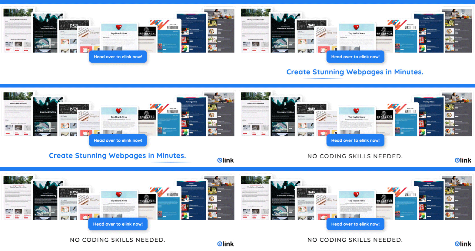
Banner CTAs are displayed at the top or bottom of a webpage and can be either static or animated. They are useful for drawing attention to important announcements, promotions, or calls to action. Banners often feature concise and attention-grabbing messages along with visually appealing graphics.
Examples include “Shop the Summer Sale,” “Limited Stock Available,” or “Join Our Rewards Program.” Effective banner CTAs are visually appealing, communicate urgency or value, and are placed strategically to be easily noticed without obstructing the user’s view or experience.
Now that you know a little about CTAs, let’s take a look at how to write an effective one for your campaign!
🚀 Build, organize, and share content that actually gets clicked—try elink.io.
How to Write an Effective CTA that Actually Gets Clicks
Writing CTAs for your marketing campaigns is a bit of a balancing act. You want people to do something, but you don’t want to sound salesy or out of place in their feed. A good CTA feels like a natural next step: tap a link, save this for later, drop a comment, or share it with someone who needs it. So let’s dive in and break down how to write CTAs that really work.
1. Be Concise and Clear
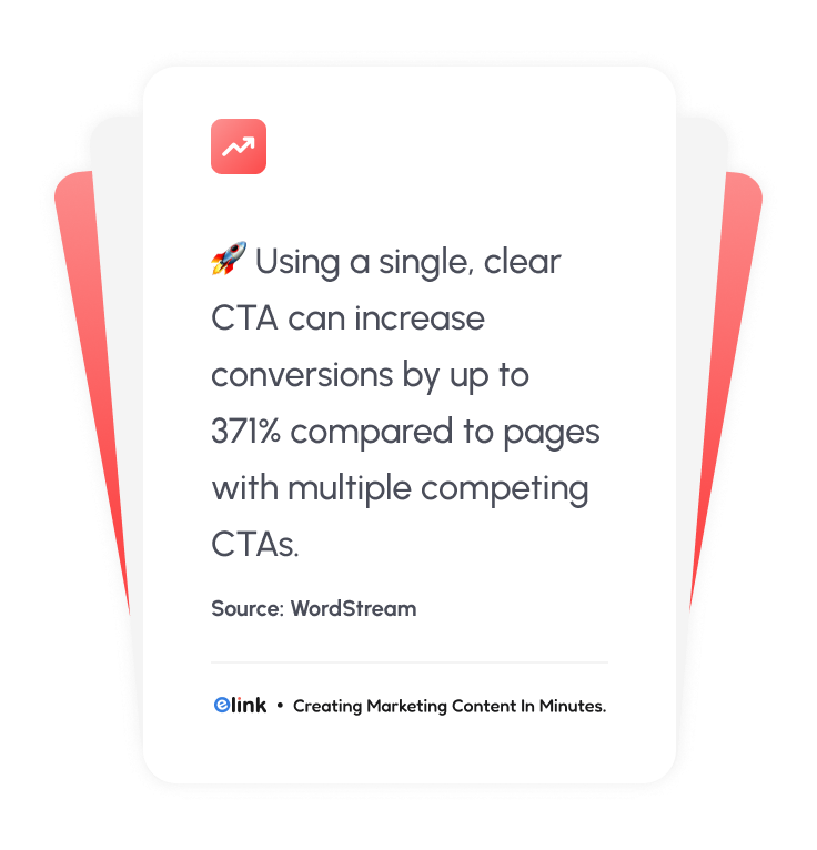
Character limitations on platforms such as Twitter, Instagram, or Email make it essential to keep your CTAs short and concise. Getting straight to the point and using language that clearly conveys the desired action is crucial. By being straightforward, you avoid ambiguity and make it easy for your audience to understand what you want them to do. Use concise and direct wording that leaves no room for confusion.
Be specific about the action you want users to take, whether clicking a link, sharing a post, or leaving a comment. Keeping your CTAs clear and to the point increases the chances of users quickly comprehending and acting upon your call to action. Remember, simplicity and clarity are key to effectively communicating your message and driving engagement.
2. Create a Sense of Urgency
In the fast-paced world of social media, creating a sense of urgency in your CTAs can effectively drive immediate action from your audience. You can tap into the psychology of scarcity and exclusivity by using time-sensitive language or limited-time offers. This will prompt users to take action quickly.
The sense of a limited opportunity or a time constraint adds a sense of urgency and FOMO (fear of missing out). This urgency motivates users to engage with your CTA promptly, fearing they might lose out on a valuable offer or opportunity.
Example: “Offer ends today. Don’t miss out!” creates urgency and encourages users to act immediately.
3. Use Compelling Verbs
When crafting CTAs for social media, it’s important to use action-oriented verbs that inspire and motivate users to take the desired action. Action-oriented verbs make your CTAs more persuasive and engaging.
For example, “Discover,” “Learn,” “Try,” or “Join” all convey a sense of action and motivate users to engage with your CTA. Incorporating these verbs into your CTAs makes them more persuasive and captivating, increasing the likelihood of user engagement and conversion. Remember to choose verbs that resonate with your target audience and match the desired action you want them to take.

4. Highlight Benefits or Incentives
A crucial element to include while creating CTAs is clearly communicating the value or benefits users will receive by responding to your CTA. By highlighting the value proposition, you give users a compelling reason to take action and increase their motivation to engage.
Clearly stating the benefits helps users understand what they stand to gain by clicking, sharing, or participating. It could be exclusive access to information, discounts, educational resources, entertainment, or the opportunity to be part of a community or conversation.
Remember to align the benefits with the interests and desires of your target audience to make the CTA even more appealing.
5. Leverage Hashtags and Mentions
Using hashtags and mentions in your CTAs on social media can help you reach more people and boost engagement.
Hashtags make your CTA visible to a wider audience interested in the topic or theme associated with the hashtag. They help people discover your content when they search or follow those hashtags. Example: “Share your #MondayMotivation stories with us” encourages users to participate in a specific hashtag campaign, increasing engagement and visibility.
Mentions, on the other hand, can attract the attention of specific individuals or brands. By mentioning their username or handle, you increase their chances of noticing and engaging with your post.
Know More About: The Role of Hashtags in Social Media Marketing!
6. Customize for Each Platform
Each social media platform has its own style, norms, and audience expectations. Tailor your CTAs to fit the specific platform to maximize their effectiveness.
Consider the tone and voice that are commonly used on each platform. For example, Instagram tends to be more visual and casual, while LinkedIn is more professional and business-oriented. Adapt your language and style accordingly to match the platform’s norms and the expectations of its users.
Formatting is also essential to consider. Platforms like Twitter have character limits, so your CTAs need to be concise and straight to the point. You have more space on platforms like Facebook or LinkedIn to provide additional context or information.
Example: On Instagram, where liking posts is common, a CTA like “Double-tap if you agree” encourages users to engage by liking the post. On LinkedIn, a platform focused on professional networking, a CTA like “Join the discussion in the comments” would be more appropriate.
Now that you’ve got the basics of crafting CTAs down, let’s look at some real-world examples that actually drive good results.
Common Call to Action Examples
When choosing a CTA, consider your desired outcome, such as increasing visibility to your post, collecting an email address, or completing a purchase. Pick any CTA from this list that matches your moment, and it’ll feel effortless instead of forced.
CTAs for Building Awareness
Sometimes you just need people to pause and check you out, no strings attached. These are generally light-hearted and inquisitive in their tone.
- “Curious? Tap to see the full story.”
- “Want the details? Check it out here.”
- “Keep scrolling, it gets better from here.”
Check our guide: How to Increase Website Traffic Without Paid Ads- Elink
CTAs for Driving Engagement
This is where you draw your audience in closer: through comments, saves, and shares- like having conversations with your closest friends on social media.
- “What do you think? Drop it below.”
- “Save this for when you need it later.”
- “Tag a friend who’d love this.”
CTAs for Lead Generation
Time to collect those emails or signups without scaring folks off. Make it feel like a quick win for them.
- “Grab the free guide, just add your email.”
- “Sign up and get the checklist today.”
- “Download your template right now.”
CTAs for Sales and Conversions
After preparing your audience for a sale, they are prepared to convert. You will use these as a way to push them gently toward conversion, particularly when combined with a free trial or limited-time offer such as a discount.
- “Ready? Start your free trial here.”
- “Add to cart before it’s gone.”
- “Shop now and save 20%.”
CTAs for Community and Loyalty
Want people sticking around long-term with your brand? This is where these calls to action come into play.
- “Follow for more tips like this.”
- “Join the crew and stay in the loop.”
- “Subscribe so you never miss one.”
Ready to put these CTAs to work? Tools like elink.io make it dead simple.” Test it, your next newsletter could see clicks jump.
👉 Bonus Tool: elink.io for CTA-Powered Newsletters
Creating CTAs that actually get clicks is just half the battle. The challenge comes with getting those CTAs into newsletters, embeds, or social posts that look good and work smoothly on any device. Most creators spend hours designing, coding, or tweaking clunky tools that barely convert.
elink.io makes this easy. It’s a simple, drag-and-drop platform that transforms your curated links into beautiful, clickable newsletters, embeds, or social posts, no design skills needed. Add your blog posts, videos, offers, or resources, attach attention-grabbing buttons like “Claim Your Discount” or “Dive In Now,” and share everywhere, fast and hassle-free.
Top Features That Make elink.io amazing:
- A drag‑and‑drop content builder that turns links into engaging blocks that look great instantly.
- Over 50 ready‑to‑use layouts so your newsletters and pages look professional every time.
- Built‑in call‑to‑action buttons you can add anywhere to boost clicks and conversions.
- RSS feed integration to automatically pull top content into your newsletters or pages.
- Publish as email newsletters, single web links, embeds on your site, or social bio pages.
- Chrome extension lets you save and update links on the fly and keep content fresh.
- Works with your favorite email tools like Gmail, Mailchimp, ActiveCampaign, and more.
- Team collaboration lets multiple creators save, curate, and build together.
With elink.io, creating clickable, high-converting newsletters and content pages is no longer a headache; it’s fast, fun, and actually drives results.
Wrap Up
To wrap it up, your call to action (CTA) is key to social media success. With the right words, you can inspire your audience to take action, whether it’s clicking, downloading, or buying. But if your CTA falls flat, it will be overlooked as people scroll by.
We hope our blog has helped you learn a bit about CTAs and how to create them. Remember, a powerful CTA can supercharge your social media campaign. Thanks for reading, and best of luck!
FAQ’s
1. What are some strong call-to-action phrases?
Some powerful CTAs include “Shop Now,” “Subscribe Today,” “Get Started,” and “Join Free.” These short, direct phrases create urgency and make it clear what the next step is.
2. What is a call to action (CTA) in marketing?
A CTA in marketing is a short phrase or button that tells your audience what action to take next. It could be signing up for a newsletter, downloading a guide, or purchasing a product.
3. What is the difference between a CTA button and a CTA link?
The primary distinction between CTA buttons and CTA links lies in their design. A CTA button is usually more eye-catching and designed to grab attention with color and design. On the other hand, a CTA link is text-based and blends more naturally into your content. Buttons often drive higher clicks because they stand out visually.
4. Can CTAs improve conversion rates?
Yes, absolutely. A strong and well-placed CTA can guide people toward taking action, which directly boosts engagement and conversions. It turns interest into measurable results.
Keep Reading & Learning 📚
How to Advertise on Social Media: Complete Step-by-Step Guide
How Does Social Media Impact on Consumer Behaviour?
How To Keep Up on The Social Media Trends in 2025
Video Marketing Strategies: 10 Ways to Boost Engagement
