Have you ever stopped scrolling halfway through the emails just because something looked too good to ignore?
That’s the magic of a newsletter everyone needs for their brand.
Today, most people judge email just on how it looks, irrespective of the content. A messy, dull design is rejected at once, but a crisp, striking, gorgeous layout gets clicked.
So, the newsletters need to be visually stunning if you want more conversions through them. Consider them as your company’s mini-magazine dropping into someone’s inbox.
The best part? You don’t have to be a design expert for newsletter designing. In this blog, we’ll guide you through easy but effective newsletter design tips to make a visually appealing newsletter. From layout and colors to fonts and images, these essential hacks will help your emails stand out and actually get read.
But before going on to newsletter design tips, let’s understand why good newsletter design matters in getting conversions.
Why Great Newsletter Design Makes a Difference?
🧠Did you know that 70% of emails are deleted in 3 seconds if they are visually appealing?
This means even may have the most valuable content in the world, but if your newsletter is difficult to read or simply boring, most readers won’t even give it a chance. That’s where design comes in.
A great design does not just make your newsletter look nice; it makes it more readable, more fun to scroll through, and much more click-worthy. It guides the eye around, draws attention to the key things, and provides a seamless, hassle-free reading experience.
Your design is the first thing that people notice. A clean, striking layout immediately says to readers, “Hey, this is worth your time!” It also invites people to engage with your content, build trust, and that’s precisely what you want.
So, in short, newsletter designing allows you to make a long-lasting impression on the audience. Now, let’s discuss some effective newsletter design tips to make your newsletter shine.
Smart Newsletter Design Tips to Make Newsletters Shine
Okay, so after going through why design is important, you may be wondering how to design a newsletter that wows your audience. Let’s go through the essential newsletter design tips, which are given with real-life examples to help you visualize them better.
1. Keep It Clean and Simple
The first thing to keep in mind while designing a newsletter is to keep it simple and organised. A messy email with lots of text, images, and buttons can feel overwhelming. Don’t overload your reader.

For instance, imagine opening a newsletter with 5 different fonts, neon colors, and zero spacing: would you read such an email? No, right?
So, you should go for a clean layout with a nice header, one main image, short text, and a single call-to-action. The easier on the eyes, the more effective it is.
2. Choose Easy-to-Read Fonts
Font choice also matters in newsletters. Your font should be clear, modern, and super easy to read, particularly on mobile. For this, you can utilise the best fonts like Arial, Open Sans, or Lato.
Just for instance, you can use bold Body text in Lato, regular Body text in Open Sans, to make the newsletter design more crisp and professional.
3. Limit a Color Scheme
Having too many colors in your email newsletter design will make it appear chaotic. Limit yourself to 2–3 colors that are consistent with your brand.

For example, A bakery newsletter would employ soft pastels such as peach and cream with a warm brown for copy. A tech brand may use clean colors such as navy, white, and an accent of electric blue.
Quick Read👉 How To Craft Restaurant Newsletters That Get Customers Talking
4. Use High-Quality Visuals
To make the newsletters attractive, one should add high-quality pictures to them as images grab readers’ attention.
Suppose: If you are sending a travel newsletter, add a scenic photo of a beach with the wording “Your Next Adventure Starts Here.” And for selling skincare, include a clean, close-up photo of your product in a soothing, neutral background.
5. Make It Mobile-Friendly

Studies show that more than 60% of emails are opened on phones. That means the layout of newsletters has to be good on small-sized screens. For this, you can go with one-column designs, large CTA buttons, and short sentences. But, always preview your email on mobile mode before sending!
6. Use Clear Headings and Sections
You can divide your newsletter into sections with clear headings. This makes it skimmable and allows readers to quickly find what’s interesting to them. So, instead of a single lengthy paragraph, divide your email like like:
- Upcoming Event: Live Webinar This Friday!
- Join us at 6 PM to discover how to grow your brand on Instagram.
- Product of the Week
- Say hello to the sustainable tote bag
7. Add a Strong Call-to-Action (CTA)
Don’t leave your readers wondering what to do next. Let them know and make your button pop! For this, you can use a colorful button that reads: “Shop the Sale”, “Download the Free Guide”, or “Reserve Your Spot”, etc. Remember to put CTAs after your primary message, not at the bottom where nobody will see it.
👉Pro Tip: Have one primary objective for your newsletter. It can be “Want people to read your blog, selling a sale, or anything else.” Use a catchy subject line and CTA. And most importantly, don’t attempt to do everything with one email; it just gets cluttered.
By following these amazing newsletter design tips, you can take your newsletter design to the next level. But along with hacks, you need to pay attention to some of the mistakes to avoid while designing. Let’s discuss them also.
Also Read💡 Best Call To Action Examples That Will Drive Traffic!
Common Newsletter Design Mistakes to Avoid
You will all agree that, even with creative newsletter design, a few small flaws can negatively impact the performance of your newsletter. But the best part is you can avoid these simple errors just by keeping an eye on the following checklist.

- Do not add too much text to the newsletter. Keep it concise, readable, and to the point.
- Do not make the layout messy with too many images, buttons, or divisions.
- Always instruct your reader on what to do next, add a clear Call-to-Action (CTA) such as “Shop Now” or “Read More.”
- Do not ignore mobile Users. Ensure your design also looks good on mobile.
- Avoid using too many fonts or colors. Use 1–2 fonts and a consistent palette to make your design neat and professional.
- Always add alt text to Images. Even if an image fails to load, alt text lets users (and screen readers) know what it was about.
By following these simple but powerful newsletter design tips (and adding your own creative touch), you’ll be sending out newsletters that don’t just land in inboxes, they get opened, read, and loved. After reading this, if you are wondering for some sample newsletter designs, then don’t worry, we’ve got you covered!
Effective Newsletter Layout with Structure That Actually Works
Let’s face it, it can be tricky to design a newsletter if you don’t know what and where to add in the layout. But with the right structure, your content is easier to read, more interesting, and more likely to receive clicks and conversions!
Take a look at some basic but effective newsletter examples below that you can apply depending on your goals:
1. The Classic One-Column Layout
–Add an image—
Best for: Blogs, updates, and announcements
Why it works: It’s clean, simple, and easy to scroll, especially on mobile. And also perfect if you want to highlight one thing clearly and avoid clutter.
Structure:
- Header (Logo or Title)
- Main Headline
- Short Introduction
- One main article or announcement
- CTA button (e.g., “Read More”)
- Footer with social links and contact info
2. The Multi-Section Layout
–Add an image—
Best for: News roundups, curated content, or multi-topic newsletters
Why it works: Organizes different types of content into easy-to-read blocks. It is the best newsletter design for sharing several updates or when you want to keep readers engaged with variety.
Structure:
- Header
- Intro Paragraph
- Section 1: Blog or article with image + short text
- Section 2: Product or update with CTA
- Section 3: Tip, video, or social post
- Final CTA or message
- Footer
3. Product Grid Layout
–Add an image—
Best for: E-commerce or promotional emails
Why it works: Showcases multiple products side-by-side in a visual format. It works best when you need to highlight a collection or sale in an attractive manner.
Structure:
- Header with brand logo/name
- Attractive banner image
- Grid of 2–4 products (image, title, price, CTA)
- “View All” or “Shop Now” button
- Footer
4. The Curated List Layout
–Add an image—
Best for: Communicating external content such as articles, tools, or videos
Why it works: Fast, handy, and simple to scan. Best newsletter design for weekly summaries or content roundups.
Structure:
- Title: “Top Picks of the Week” or “What We’re Reading”
- Intro (1–2 lines)
- List of 4–6 links with brief descriptions
- Optional: image or icon next to each link
- CTA to go to your blog, podcast, or primary website
5. The Educational Layout
–Add an image—
Best for: Tips, guides, tutorials
Why it works: It emphasizes value: educating or informing your reader. Use this if you need to give useful content that establishes trust.
Structure:
- Header
- Main question or topic (e.g., “How to Write Better Emails”)
- 3–5 concise tips or steps
- Images or icons to space out text
- CTA: “Read Full Guide” or “Download PDF”
- Footer
Well, regardless of which layout or newsletter example you use, always keep it clean, use visuals to break up text, have one purpose per email (don’t confuse your reader!), and make sure it looks good on mobile.
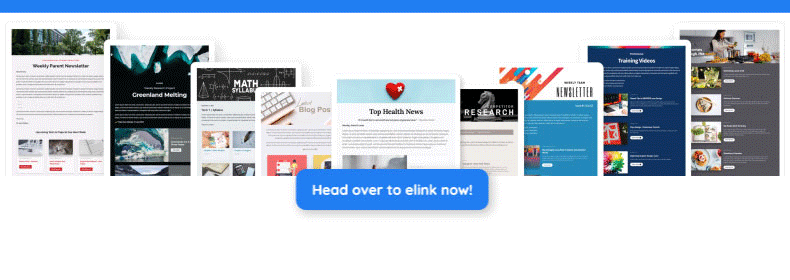
🚀Need to make the layout design easier? Use eLink and customize pre-designed templates to create a stunning newsletter.
Why Elink is Your Go-To Tool for Newsletter Design
Even after going through newsletter design tips, you are still considering creating a newsletter a daunting task, then try using elink.io. With eLink, you can make stunning, professional newsletters within minutes without any design expertise.
Here’s how Elink can simplify newsletter designing and make it look amazing:
✔️Select from Pre-designed Templates: Select a design from the templates that suits your taste and intent – blog posts, product releases, curated lists, and more. Here, each template is designed to display perfectly on all devices.
✔️Copy Any Web Link & elink Creates the blocks for you: Simply paste a URL (such as a blog post, video, or product page), and elink will fetch the image, title, and description automatically. It transforms flat links into gorgeous content blocks.
✔️Customize according to your needs: Quickly add your logo, modify colors, change fonts, and fine-tune layouts so your newsletters are always like you. No design skills required!
✔️100% Mobile-Friendly: All eLink newsletters are mobile-friendly, which means they’ll look great on phones, tablets, and computers, without you needing to lift a hand.
✔️Export to Any Email Platform: When you’re finished, you can export your newsletter to email platforms such as Mailchimp, Gmail, Outlook, Constant Contact, and others with a few simple clicks.
✔️Save Time with Automation: Link RSS feeds or bookmark folders, and elink will bring in the fresh content automatically — ideal for fortnightly updates or handpicked newsletters.
Creating beautiful newsletters with elink.io isn’t just simple, it’s enjoyable. Do follow the newsletter design tips and give it a try, and discover how fast you can transform your content into something your audience actually looks forward to opening and reading.
Here is an awesome newsletter example created for a decor blogger, have a look!
Final Words
Your newsletter isn’t just another email; it’s your message, your brand, and your voice dropping right into someone’s inbox. And with good design, it can really shine.
Small newsletter design tips like simple layouts, quality images, compelling CTAs, and mobile-optimized designs make a huge difference to the newsletters. It’s not about being stylish; it’s about being simple, consistent, and reader-friendly.
So, whether you’re sending news, selling products, or telling stories, think about the people on the receiving end. Make it simple for them to read, scroll, and act, and they’ll be coming back for more. It’s like awesome content attracts them, and awesome design retains them.
Now, go ahead, follow the necessary newsletter design tips and create a newsletter that not only looks good but also brings conversions.
FAQs
Q1. Why does newsletter design matter so much?
Most people judge emails by appearance. A well-crafted newsletter design captures the attention of the audience and brings more conversions in return.
Q2. Which design elements are essential for a good newsletter design?
The design elements every newsletter must include are a header, body content, images, a CTA button, and a footer.
Q3. How often should I send newsletters?
Ideally, you should send a newsletter once or week or every other week, depending upon your services. Make sure not to overwhelm the reader with repeated emails.
Q4. Are there any free tools to design stunning newsletters?
Yes, you can use tools like Canva, Mailchimp, and Brevo for free to create stunning newsletters with no design expertise required.

Keep reading & learning
How to Use Email Marketing for Effective Content Distribution
What are Newsletters & How to Create One in a Few Minutes?
Increase Newsletter Engagement Rate with these 7 Awesome tips!