Imagine walking into a new store, but the second you step inside, someone blocks the door and demands your email address. You would turn around and leave, right?
That is exactly what most websites do. You click an interesting link, start reading, and boom—a giant box blocks your screen. You probably close it instantly without even looking.
But wait. Think about the last time you actually typed your email into one of those boxes. Why did you do it? Did they offer a secret discount, a free gift, or a fun quiz you simply could not resist? Well, when built correctly, that little box of email pop-up is not annoying at all. It is the fastest way to gather loyal fans without spending a single penny on ads.
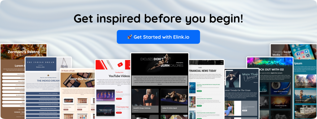
So, in this complete guide, you will discover the exact psychology behind high-converting email pop-ups and why people choose to sign up. We will start by explaining what an email pop-up actually is, and then break down 12 high-converting examples so you can see exactly why people click them. After that, we will reveal the hidden best practices data, show you how AI is making pop-up design smarter, and explain how elink.io keeps all your new fans hooked.
Are you ready to unlock this simple growth cheat code? Let’s start with the basics: What Is an Email Pop-Up?
What Is an Email Pop-Up?
An email pop-up is a small window or form that appears on a website and encourages visitors to subscribe to an email list.
Businesses use email pop-ups to collect email addresses, grow their subscriber base, promote special offers, share valuable content, and build stronger relationships with potential customers.
But do people really sign up through these email pop-ups? Well, yes, they sure do!
Most normal pop-ups get about 5 percent of people to sign up, but the absolute best ones catch a huge 58 percent of visitors!
Why is there such a massive difference? Do you want to see exactly how the winners do it? Let’s explore 12 High-Converting Email Pop-Up Examples to help you make the right choice.
12 High-Converting Email Pop-Up Examples (and Why They Work)
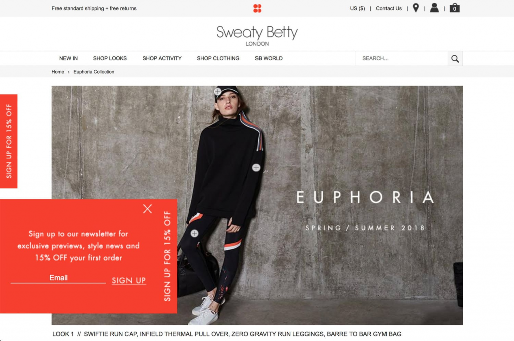
1. The Welcome Discount Pop-Up
This is a pop-up that greets first-time visitors and offers an immediate discount, usually 10 – 15% off their first order, in exchange for their email.
New visitors have yet to decide whether to trust your brand. Offering a discount removes hesitation and gives them a reason to register and make a purchase. This is the most common email signup pop-up example in e-commerce, as it directly links the list growth with revenue.
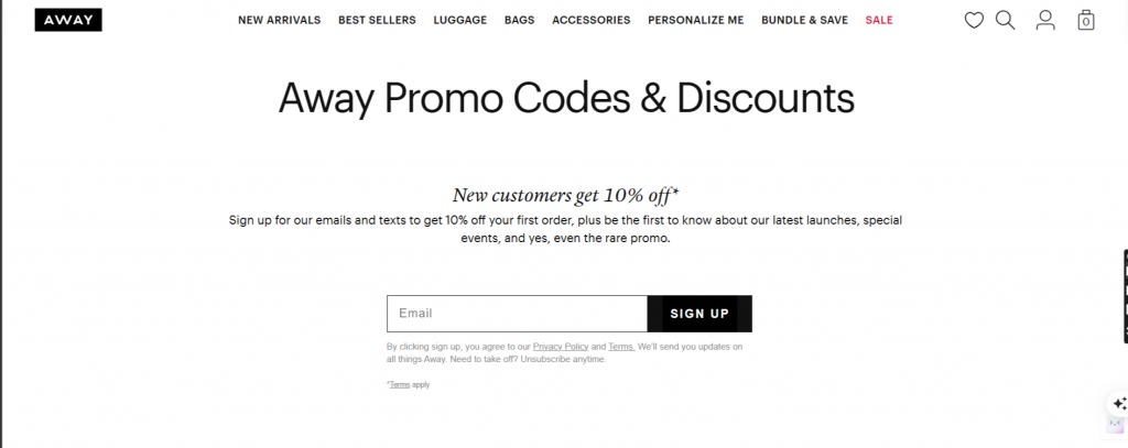
For example, Away Travel offers a clean and minimal light box to first-time visitors with a 10% discount. There is one field, one CTA button, and a clear offer. No clutter.
Read more: Welcome Email: How to Craft the Perfect One (With Examples)
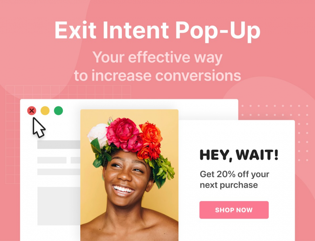
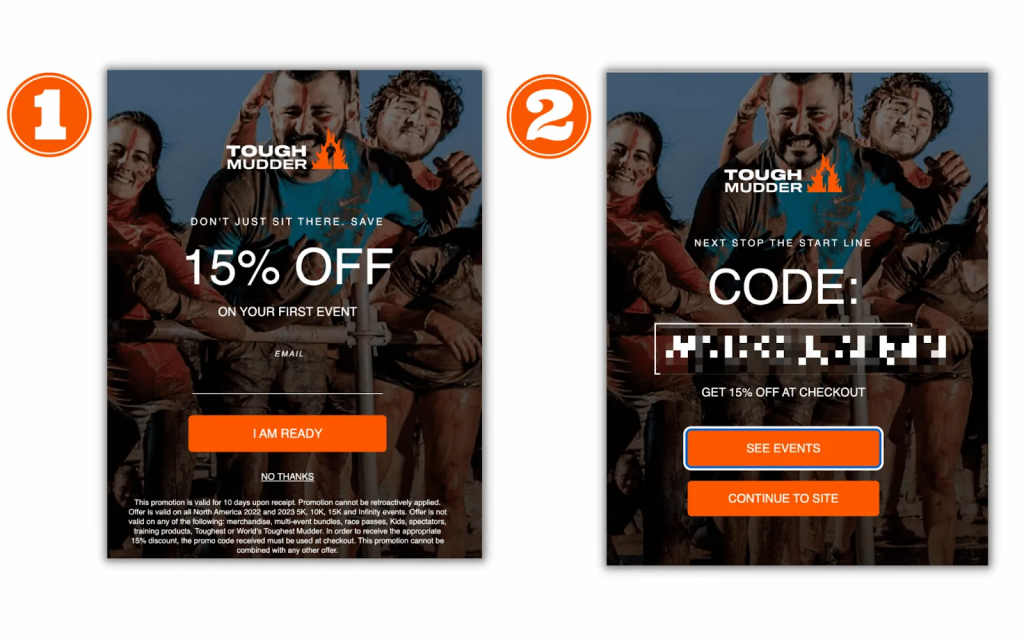
2. The Exit-Intent Pop-Up
Exit-intent pop-ups are pop-ups that appear when a visitor is about to leave a website (i.e., when their mouse moves toward the close browser or back button).
The brand Casper has set an exit pop-up that pops up when a visitor tries to leave without making a purchase. It offers free shipping, a discount, and asks for only one thing in return: their email.
3. The Spin-to-Win (Gamified) Pop-Up
A gamified spin wheel which visitors spin to land on a reward – usually a discount of between 5% and 25%. To spin, they must first enter their email address.
It makes signing up a small game. People love the feeling of ‘winning’ something – even if the prize is modest. The uncertainty of the wheel is therefore bound to make engagement high and ensure people do not have to suffer the friction of having to fill in a form.
Paula’s Choice offers visitors the chance to win prizes from free products to percentage discounts through a spin-to-win pop-up. Sign-up rates were observed to jump significantly after launching the gamified version.
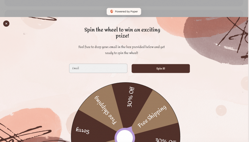
DID YOU KNOW? Gamified pop-ups have an average of 13.23% conversion rate.
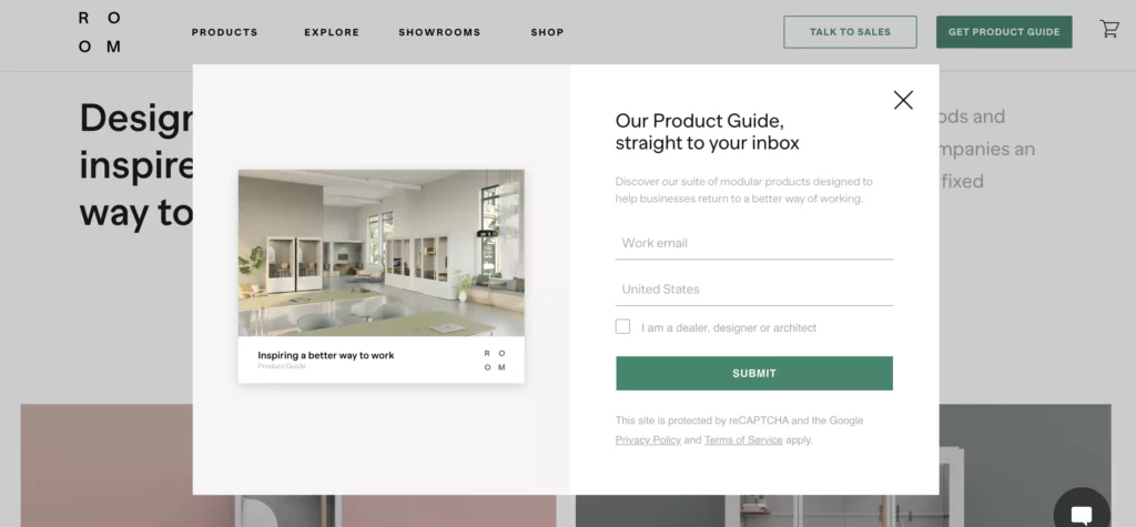
4. The Free Resource (Lead Magnet) Pop-Up
Instead of a discount, this pop-up offers something educational or useful for free — an ebook, a checklist, a template, a guide, or a mini-course.
Lead magnets draw only the ‘right’ people, those who are genuinely interested in what you do. A visitor who downloads your «Starter Kit for Getting Started with Email Marketing» is much more likely to stay interested in your work than someone who signed up for a 10% discount that they will never make use of.
HubSpot lead magnet pop-ups are in use all across their blog and provide free templates and guides that are relevant to what the visitor is already reading on the website. High relevance, high conversion.
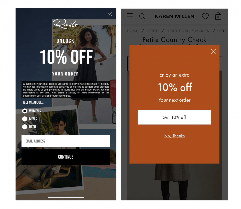
5. The Multi-Step (Two-Question) Pop-Up
Instead of asking for an email at once, this pop-up starts with a yes/no question (“Do you want 10% off?”). Only after clicking “Yes” does the field for entering an email address appear.
The technique relies on the psychology of commitment. When a customer clicks “Yes,” they have made up their minds about the offer, so backing out later would be self-contradictory. As the first step is too easy, the overall conversion rate rises.
A good example of this strategy comes from Beardbrand. It starts with a question— “Would you like exclusive grooming tips?” A click makes it possible to fill in the e-mail field. And so it goes into the email field—simple, smooth, and effective.
Read more: Call to Action Examples that Boost Traffic & Conversions
6. The Quiz Pop-Up
A pop-up that asks 2–3 quick questions about the visitor’s preferences or goals, and only at the end asks for their email.
Quizzes are intimate and enjoyable. They also gather highly detailed information about the subscribers – their interests, difficulties, and preferred topics. All this information means immediate improvements to emails.
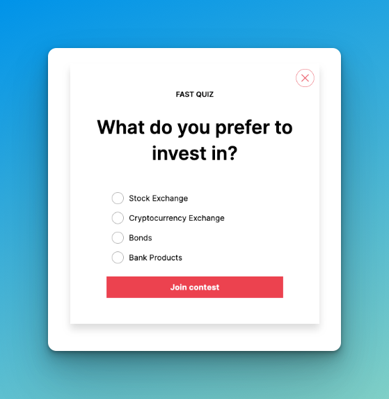
There is a brand, “Prose” (a personalized hair care brand), that asks you to complete a quiz on your hair type and goals and then requests an email address to send a personalized recommendation. There is a high level of motivation among visitors to complete the same.

7. The Timed Delay Pop-Up
A pop-up that appears only after a set number of seconds, giving the visitor some time to look through the page before the pop-up appears.
Immediate pop-ups are the biggest complaint not only for this type but for all pop-ups in general. The visitors have not read anything yet so there is no reason for them to sign up. A timed delay pop-up shows respect for the browsing experience and gets better conversion since the visitor is invested in the content already.
The New York Times delays its newsletter pop until a visitor has spent around 60 seconds reading an article. By then, they’ve already decided that not only their time but also their email is well spent.
8. The Scroll-Triggered Pop-Up
A pop-up that appears once a visitor has scrolled down a set percentage of the page – usually 50–70%.
Scroll behavior is a strong signal of interest. Changing Pages (Scroll): Someone who scrolls halfway down your blog post is clearly reading, not bouncing. That is where you want to offer more content or a related lead magnet.
Copyblogger uses scroll pop-ups on blog posts that offer a free writing guide on a topic related to the article after the visitor has scrolled 60% of the page. The offer feels earned, not forced.
Read more: Email Newsletter Examples: 20 High-Converting Ideas You Need to See
9. The Sticky Bar Pop-Up
A thin banner that sticks to the top or bottom of a screen when scrolled by visitors. However, it is never intrusive.
It is the least obtrusive way to keep a signup offer on every single page without forcing attention. It is perfect for site-wide announcements — limited-time offers, free shipping thresholds, or seasonal promotions.
Brooklinen uses a top sticky bar with free shipping info and a signup CTA. It never interrupts the browsing experience but is ever-present when someone opts for the decision to be made.
DID YOU KNOW? Sticky bars get more than 126 million views and yield a 3.69% conversion rate.
10. The Mobile-Optimized Pop-Up
A pop-up that is well suited to smaller screens (full width, easily clickable, minimum text with a single clear CTA).
Most websites receive more than half of their visitors from mobile users. If there is a desktop pop-up that does not adjust to the mobile, it looks broken, annoying, and kills conversions. A mobile-sized pop-up with tap-and-go functionality uses the platform where people are most likely to take quick actions.
ASOS runs separate mobile pop-ups, which are full-width, feature large CTA buttons, and require only an email address to claim a first-purchase discount. It’s clean, fast, and optimized.
11. The “Coming Soon” or Early Access Pop-Up
A pop-up that offers visitors to join a waitlist or get early access to something that isn’t out yet — a product launch, a limited collection, or a new service.
Scarcity and exclusivity are strong psychological triggers. People crave being ‘first’. People love being ‘first’, and this type of pop-up ensures people are warm and on an email list long before there is anything to sell so launch day can land in front of people who are already waiting for it.
When Superhuman launched their email app, they used a waitlist pop-up on their homepage. Before a single line of code was made public, they had tens of thousands of people queued up on a waitlist, all thanks to a simple ‘request early access’ form.
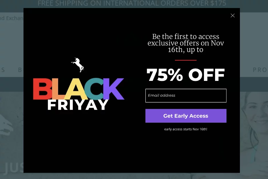
12. The Seasonal or Event-Based Pop-Up
A timed pop-up associated with a specific event — Black Friday, New Year, a product anniversary, or some other point where urgency is logical.
Urgency is one of the most tried and tested conversion drivers in marketing. “This offer expires” is one of the sure-fire conversion drivers in marketing that creates the real motivation to do it now and not maybe later. The most significant advantage of seasonal pop-ups is that you can run a high-converting campaign without changing your regular strategy.
Sephora runs holiday pop-ups with countdown timers that gift sets or extra points in limited time sale windows. The timer makes him an active decision-maker rather than a passive visitor.
Email Popup Best Practices: What the Data Actually Says
Looking at those 12 examples, a few clear patterns emerge. Here’s what the research consistently shows what works for email pop-ups and what quietly kills conversions.
| Best Practice | Why It Matters | Data Point |
| Delay your pop-up by 6+ seconds | Visitors need time to engage first | Timer triggers outperform immediate ones by 67% |
| Use one field only | Fewer fields = less friction = more signups | Single-field pop-ups convert at 4.87% |
| Add an image | Visual content grabs attention faster | Image pop-ups convert 2.2% vs. 2.1% without images |
| Always offer something | People sign up for value, not forms | Discount pop-ups average 8.62% CVR |
| Optimize for mobile separately | Mobile converts better when designed for it | Mobile pop-ups convert 36% better than desktop |
| Test exit-intent triggers | Catch visitors before they leave | Exit-intent + timer = 14.41% conversion |
| A/B test regularly | Small tweaks make huge differences | Top 10% popup campaigns exceed 20% conversion rates |
Now that we are acquainted with the best practices, it is worth considering how to design these pop-ups for the AI era specifically. List building can be taken to the next level by designing pop-ups in the AI era using the best practices alongside the help of AI tools.
How AI Is Making Email Pop-Up Design Smarter
So, there was no research for figuring out which design can work successfully for building an email list. However, now it is the AI that helps you design smarter, faster, and more effective pop-ups, eliminating guesswork.
A few intelligent ways of using Artificial Intelligence for designing email pop-ups that convert are:
1. Generate High-Converting Copy
Need to write a hook? Specify your target audience and what you are offering to an AI writing tool (e.g., “Write me a short, snappy pop-up headline that offers 15% off to busy moms”). It can come up with dozens of variations instantly, which is useful for testing different angles such as urgency, curiosity, or value propositions.
2. Predictive A/B Testing Ideas
Instead of blindly testing colors, analyze your brand with AI. Ask an AI tool, “What are two pop-up design variations based on a minimalist, eco-friendly brand identity to test for an exit-intent offer? In case you need to ditch the color scheme or layout, AI can also offer specific contrasting recommendations statistically proven to work best in your industry.
3. Automated Image Generation
Need to create a new background image for a seasonal pop-up but have no graphic designer? It takes only a couple of seconds for AI image generators to produce tailor-made images. You can specify certain styles, such as “a flat lay of coffee beans with a blank central space for text, warm tones,” and get the background image tailored so the seasonal pop-up looks professional and matches the campaign perfectly.
4. Analyze Your Competitors
If you’re stuck on design, feed screenshots of competitor pop-ups into an AI appraisal engine. Ask it to determine the psychological triggers and design archetypes they are using. This is where industry standards are established, and there is an opportunity to identify areas where differentiation is possible.
All of this makes the email capture much ‘smarter’, faster, and way more relevant. But, once the user has signed up (no matter how they were targeted), the next step is the same – showing up in their inbox with something useful to read. That’s why the right newsletter tool is just as important as the right pop-up.
Read more: 10 Email Preheader Best Practices To Boost Open Rates!
How Elink.io Helps You Turn Pop-Up Subscribers into Loyal Readers
The first step is getting a person’s email through a pop-up. Getting someone’s email through a pop-up is only the first step; the real job is to keep them engaged, and this means sending newsletters that they actually want to open.
That is where elink.io steps in.
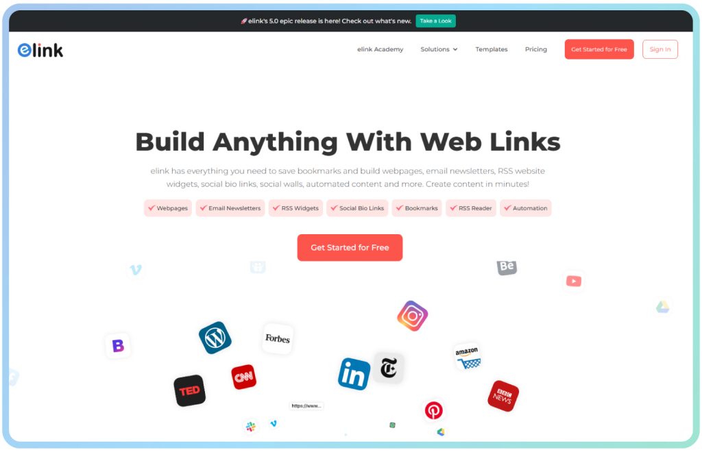
elink.io is a smart newsletter creation & content curation platform that lets you create email newsletters that are professional and good looking in just a few minutes — no coding, design skills required, or hours spent fiddling with formatting. You collect the subscribers through your pop-up; elink helps you keep them.
Here’s how elink.io helps you transform new subscribers into loyal readers:
Email Newsletters
elink.io lets you quickly turn links, blogs, and online content into beautiful email newsletters without any coding or design skills. Adjust colors, fonts, and layout to suit your brand identity. You can even export to Mailchimp, Gmail, ActiveCampaign, and other platforms: new subscribers quickly get interesting content.
Professional Templates
Elink.io provides 50+ ready-made, professional templates that help you create clean and professional newsletters in minutes. No need to start designing from scratch!
RSS Builder & Automation
The RSS Builder feature automatically pulls fresh content from your favorite blogs, news sites, and YouTube channels into your newsletter. No more hunting for content, elink ensures your emails are relevant every week.
Bookmark Manager
Save, organize, and manage all your web links in one place with folders, tags, and a searchable library with elink’s bookmark manager.
Social Bio Links
Create customizable social bio link pages for Instagram, Twitter, LinkedIn, and other platforms to share multiple links in one place.
📺 Watch the video below to see how elink.io works: 👉
Ready to send your first newsletter to your new subscribers? 👉 Explore elink.io Newsletter Templates
Read More: 9 Ways to Revamp Your Newsletter Using elink!
Conclusion
Email pop-up windows are often misunderstood. The ones people hate–the ones that pop up before one has read a single sentence and offers absolutely nothing in exchange for them are just bad pop-ups. Examples from this guide illustrate what an effective (good) pop-up is: relevant, well-timed, and valuable.
So, pick two or three examples from above that best fit your audience. Keep it simple. Use one variable at a time. And when those subscribers start coming in, make sure you have a plan for what happens next – because a great pop-up that leads to a forgettable newsletter is still a missed opportunity.
Your email list is one of the most treasured possessions for any business. Build it purposely and nurture more aspects.
FAQs
Q. What is an email pop-up?
An email pop-up is a small window that appears on a website asking for the visitor’s email, usually in return for a discount or free material.
Q. What is a good conversion rate for an email signup pop-up?
The 2026 average stands at 4.82%. Top campaigns average over 57%.
Q. What are email pop-up best practices?
Delay by 6+ seconds, use one field, always offer something valuable, optimize for mobile and A/B tests regularly.
Q. What is the best type of high-converting email pop-up?
Gamified spin-to-win popups (13.23%), quiz popups (15.2%), and exit-intent popups with timers (14.41%) consistently lead conversion benchmarks in 2026.
Keep reading & learning 🚀
- How to Close an Email Professionally: Tips & Examples
- Email Retargeting 101: How to Win Back Lost Customers
- 15 Email Marketing Best Practices For Your Next Campaign!
- 7 Email Marketing Metrics to Monitor