Ever wonder why some newsletters make you want to read every word, and even click that tempting little “Read More” button, while others just go straight to your trash folder? Well, it’s not just about what’s written, but how it looks and feels when you open the newsletters.
Think of your newsletter as a virtual handshake with your audience. The design is your first impression: if it’s clunky, cluttered, or confusing, you lose the moment.
But if the newsletter is clean, clear, and a little bit delightful? People stick around and even look forward to the next one.
Well, good design isn’t about making things flashy or complicated. It’s about helping your readers enjoy the experience, find what matters quickly, and feel drawn to take action. The newsletter should feel like getting a letter from a friend instead of an overwhelming billboard.
In this post, we’ll share simple ways to improve your newsletter design so your readers stay engaged longer and actually click through. You don’t need to be a design expert; just some easy tips that anyone can use. Let’s get started with the basics.
What is Email Newsletter Design?
So, what exactly is email newsletter design? Simply put, it’s the way your newsletter looks and feels when it lands in someone’s inbox. It’s how you organize your content, use colors, choose fonts, and arrange images so everything in the newsletter is clear, appealing, and easy to follow.
Good design isn’t just about making things look pretty. It helps guide readers through your message, highlights what’s important, and makes it simple for them to take the next step, like clicking a link or signing up.
If you think of design in the context of hosting a dinner party, your content is the food, while arranging your plates, napkins, and utensils creates a pleasurable experience. If you’ve set your table well, you’ll create a space where guests feel comfortable and keep them coming back for more. This is what excellent newsletter design does for your emails.
Now that you know what newsletter design really means, let’s dive into some simple, actionable tips to improve your design and keep your readers hooked from the moment they open your email.
Check This: Best 10 Expert Tips to Improve Newsletter Open Rates
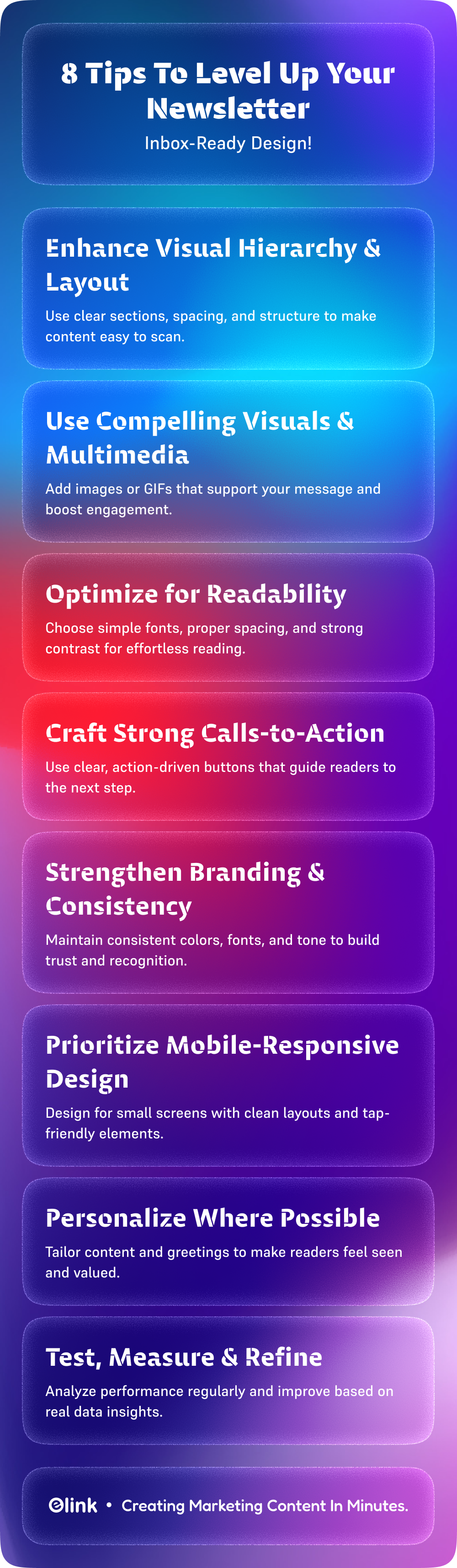
8 Ways to Improve Newsletter Design
Want your newsletters to do more than just get opened? Let’s make the newsletter something your readers actually enjoy and look forward to. Here are eight easy tips to help you improve your newsletter design and keep your audience hooked.
#1. Enhance Visual Hierarchy & Layout
Statistics show that emails with a clear layout and easily scannable content increase engagement rates by up to 50%. Usually, in email newsletters, readers tend to skim the content rather than read word-for-word.
So breaking your content into small chunks with bullet points, numbered lists, and visual breaks can make a huge difference.
Imagine walking into a room where everything is scattered everywhere; it’s overwhelming, right? The same goes for newsletters. A clean layout with clear headings, sections, and enough white space helps readers scan through your email quickly without feeling lost.
This way, your readers won’t miss the key points, and they’ll be more likely to engage.
Read More: How to Build a Strong Brand Visual Identity? (Key Elements)
#2. Use Compelling Visuals & Multimedia
In an email, the images are not for decoration but rather to tell the story of your message. A well-chosen image or GIF can hook a reader, help them interpret the message better, and provide context to your message. It adds life, personality, and emotion to an email that would otherwise feel flat.
And the numbers back it up. Newsletters that include images can get up to 42% more clicks. A simple GIF or quick video clip can add that little spark of movement your reader notices while scrolling through a busy inbox.
But balance is key. Adding too many visuals can slow down your email, look cluttered, or even push it into the spam folder. So choose visuals that actually support your message instead of filling space.
When used thoughtfully, visuals can transform your newsletter from “just another email” into something people want to open, read, and interact with.
#3. Optimize for Readability
People don’t read newsletters the way they read books; they skim. And if your email feels even a little hard to read, most readers will check out immediately. In fact, nearly 47% of people decide within seconds whether they want to continue or hit delete. That means your design has to make reading effortless.
Start with clean, easy-to-read fonts. A font size between 14–16 pt is usually the sweet spot for comfortable reading on both mobile and desktop. Avoid overly fancy typefaces; they may look stylish, but they can slow readers down.
You can also add more breathing room with white space. It makes your layout feel lighter and helps important points stand out naturally. And don’t forget contrast: using dark text on a light background (or vice versa) ensures your content is readable for everyone, including people with visual difficulties.
When your newsletter is visually calm, easy to skim, and simple to follow, readers stay longer, understand your message better, and are far more likely to click, reply, or take action.
Read More: How to Create Visually Stunning Newsletters: Essential Design Tips
#4. Craft Strong Calls-to-Action (CTA)
Your call-to-action is the moment where curiosity turns into action. It’s the bridge between “interesting email” and “actual result.” And when done right, Call to Actions can dramatically increase engagement; some studies even show up to a 371% boost in click-through rates.
To make your CTA irresistible, start with clarity. People should instantly understand what will happen when they click. Provide simple, concise, action-oriented phrases that clearly convey the desired action – “Sign Me Up,” “Get Your Free Guide,” “Download Today,” or “Get My Free Trial.” Avoid anything vague or confusing; your audience shouldn’t have to guess.
Design plays a huge role, too. Your CTA button should stand out without feeling pushy. Use contrasting colors, bold text, and plenty of white space around the button so it looks clickable and clean. One clear, well-designed button almost always performs better than a bunch of tiny, scattered links.
Placement matters more than most people think. Add a CTA near the top (for readers who skim quickly) and another toward the end for those who read everything. If your email is long, feel free to sprinkle additional CTAs in natural breaks, just don’t overdo it.
You can take it a step further by personalizing CTAs. For example, “Start Your Free Trial, Saje” or “See Recommendations for You” can make the invitation feel more relevant and increase clicks.
At the end of the day, the best CTAs feel helpful, not salesy. They guide the reader to what’s useful for them, making it easy to take the next step, and that’s what drives real engagement.
#5. Strengthen Branding & Consistency
Strong branding helps your newsletter stand out and feel familiar to your audience. When you use consistent colors, font styles, and tone of voice in newsletters, you are building your users’ trust and increasing the chance that they will return to read future newsletters. In fact, consistent branding can increase revenue by up to 23%.
Use your brand colors and logos in every email, but don’t overdo it—balance is key. Keep your style and voice steady so readers instantly recognize your message, whether it’s your first email or your fiftieth.
This sense of familiarity makes readers more comfortable and more likely to engage with your content over time.
Read more: Email Newsletter Examples: 20 High-Converting Ideas You Need to See
#6. Prioritize Mobile Responsive Design
It’s a fact that most people check their emails on their phones. Even stats show that over 60% of emails are opened on mobile devices, so a design that doesn’t look good on a small screen can cost you a lot of engagement without you even realizing it.
Mobile responsive design simply means your email adjusts itself to whatever screen your reader is using. It should be easy to scroll, read, and tap, without squinting, zooming, or getting frustrated.
A few things that really help:
- Bigger, thumb-friendly buttons that are easy to tap.
- Readable font sizes that don’t make people pinch and zoom.
- Simple, single-column layouts that don’t get messy on smaller screens.
- Images that resize automatically so nothing gets cut off or distorted.
Think about your own experience—would you spend time on a newsletter that looks tiny, cluttered, or broken on mobile? Probably not. But when your design is clean and mobile-friendly, readers stay longer, engage more, and actually enjoy the experience.
Designing with mobile in mind isn’t just a “nice-to-have” anymore; it’s one of the biggest factors in creating a newsletter your audience loves to read.
#7. Personalize Where Possible
Nobody wants to feel like just another name on a long email list. When your newsletter feels personal, readers naturally pay more attention.
Even small touches like greeting someone by their first name or sending content based on what they’ve clicked before can make your email feel more like a conversation and less like a broadcast. And it works: personalization can boost open rates by up to 29%.
The good news? Personalization doesn’t need to be complicated. You can start with simple, thoughtful tweaks such as:
- Using their name in the subject line or greeting.
- Recommending content or products based on past interactions.
- Sending birthday or anniversary messages to make them feel remembered.
- Segmenting your audience so each group receives content that actually matches their interests.
When people receive emails that feel relevant to their life, their habits, or their needs, they’re more likely to open, read, and respond. It shows you’re paying attention—not just pushing out the same message to everyone.
At its heart, personalization is about making readers feel seen, valued, and understood. And when your newsletter feels that way, engagement stops being a challenge and becomes a natural outcome.
Also Check: The Best Newsletter CTA Formulas (That Actually Get Clicked)
#8. Test, Measure & Refine
The best newsletter design doesn’t happen overnight. It’s a process of trying different things, seeing what works, and making improvements along the way. Testing different layouts, subject lines, images, and CTAs helps you learn what your audience responds to best.
Data shows that marketers who regularly test their emails see up to a 30% increase in engagement. Use tools like A/B testing to compare versions and track key metrics like open rates, click-throughs, and conversions.
Keep an eye on what the data tells you, tweak your design based on those insights, and you’ll keep getting better results every time you send.
Now, if you’re looking for a way to make these improvements even easier—and save time in the process of creating newsletters—there are smart platforms that can help. One great example is elink.io. Let’s explore!
How elink.io Can Simplify Your Newsletter Design
Creating eye-catching newsletters that truly engage your audience can be a challenge, especially if design isn’t your strongest skill. That’s why many marketers turn to tools like elink.io. Elink is a smart, user-friendly content curation platform that makes building beautiful newsletters quick and easy.
But what sets elink.io apart? Here are some standout features that help take your newsletter design to the next level:
🔸 Create gorgeous newsletters: Simply add links to articles, blogs, or videos, and elink automatically pulls in the content, creating a clean, professional newsletter without extra effort.
🔸 Mobile-Responsive Designs: Your newsletters look great and function perfectly on any device—smartphones, tablets, or desktops, making sure your readers have a smooth experience everywhere.
🔸 Customizable Branding: Easily match your newsletter’s colors, fonts, and logos to your brand, keeping your emails consistent and recognizable.
🔸 Real-Time Content Updates: Share dynamic content that updates automatically in your webpages, so your readers always get the latest info without you having to resend.
🔸 Drag-and-Drop Editor: Make quick edits to layouts, add images, or rearrange sections with an intuitive editor—no coding or design skills needed.
🔸 Analytics and Performance Tracking: Monitor open rates, clicks, and reader engagement to see what works and make data-driven improvements over time.
With elink.io, you can create newsletters your audience will actually look forward to reading.
Wrapping It Up
A professionally designed newsletter is not just a good-looking piece of content. It is the first step to creating a seamless experience that draws readers in and keeps them coming back. When your emails feel thoughtful, polished, and easy to navigate, they build trust and encourage action naturally.
The process of designing a newsletter can be daunting, but with the right tools like elink.io and a strategic approach, it is much easier to create attractive and successful newsletters. The key is to keep learning, testing, and refining so your newsletters evolve with your audience’s needs.
Ready to take your newsletters to the next level? Start experimenting today, and see the difference thoughtful design can make in turning casual readers into loyal fans.
FAQs
1. What is the best way to design a newsletter?
Use clear visuals and simple, easy-to-read content. Make sure your calls-to-action stand out, keep your branding consistent, and design for mobile devices.
2. What makes a newsletter header design effective?
An effective header is clean and clearly shows your brand, including a logo and an eye-catching layout that draws readers in.
3. How can a newsletter layout improve campaign performance?
A well-organized layout helps readers scan quickly, balances images and text, and places calls-to-action where they’re easy to find.
4. What are common newsletter design mistakes?
Common errors include cluttered designs, poor mobile formatting, inconsistent branding, hard-to-read text, and weak calls-to-action.
Keep Reading & Learning 📚
10 Email Preheader Best Practices To Boost Open Rates!
Maximizing Reader Engagement through Targeted Newsletter Articles: A Comprehensive Guide
How to Audit & Refresh Your Yearly Newsletter Calendar Mid-Year
Transforming Dull Topics into Exciting Newsletter Content: How elink Can Help
Curated Newsletter vs. Original Content: Which Converts Better?