Getting people to land on your website already takes real effort. You publish content, share links, maybe even run ads. But once they read the page, most visitors leave and never return.
That’s why newsletter signups matter. When someone subscribes, they’re not just reading one article and moving on. They’re giving you permission to show up in their inbox again. Unlike social media posts that get buried or skipped, an email waits. It can be opened later. It doesn’t disappear in a feed.
Yet this is where many websites lose momentum. Visitors come in, scroll through a post, maybe nod along, and then exit. No email captured. No way to continue the conversation.
Small, thoughtful changes in how and where you ask people to subscribe can make a noticeable difference. Below, you’ll find 20+ practical ways to boost your newsletter signups instantly, using ideas that feel natural, not pushy.
But before we dive into tactics, let’s get one thing clear.
What are Newsletter Signups? (Definition)
A newsletter signup is when a reader chooses to give you their email address so you can stay in touch with them through regular emails. These emails might include updates, helpful content, or useful resources they don’t want to miss.
That simple action is more important than it looks.
It means the reader trusts your voice. They see value in what you share. And they’re open to building a longer relationship with your brand, which leads to loyalty, engagement, or future sales.
Unlike random visitors, newsletter subscribers are people who’ve raised their hand and said, “Yes, I want more of this content.” And once you understand that, growing your newsletter stops being about chasing numbers and starts becoming about creating something worth subscribing to.
That’s exactly what the next section covers.
Below are 20+ smart, practical strategies you can use to increase newsletter signups fast, not through gimmicks, but through small, thoughtful improvements that make saying “yes” easier for your readers.
Also Read: How to Improve Newsletter Design for Better Engagement
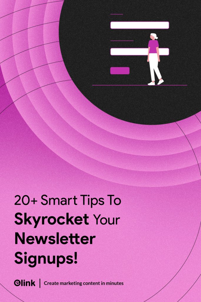
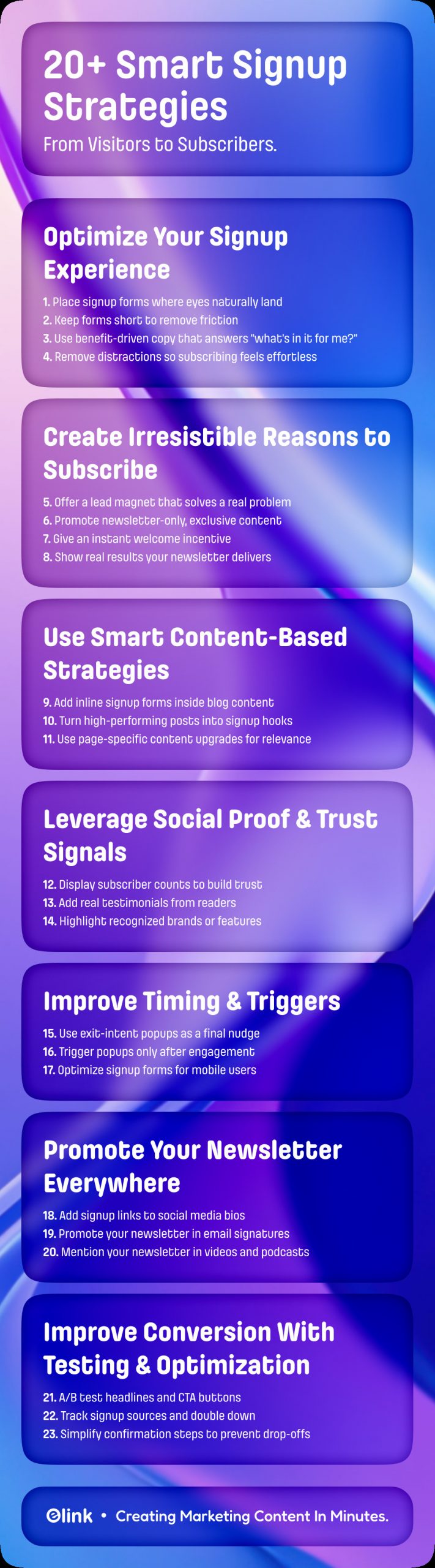
20+ Smart Strategies to Increase Newsletter Signups Fast
Growing your newsletter doesn’t come from one big change. It usually happens through small adjustments, such as where you place your signup form, what you say around it, and how easy you make it for someone to subscribe.
The strategies below focus on what real visitors do on real websites. No tricks. No pressure tactics. Just simple decisions that make signing up feel natural instead of forced.
Let’s start with the foundation.
Optimize Your Signup Experience
Before adding new ideas or tools, pause and look at your signup form the way a visitor would. Is it easy to notice? Does it appear at a moment that makes sense? Or does it pop up when someone’s in the middle of reading?
Small things matter here. When subscribing feels simple and fits naturally into the page, people don’t overthink it before subscribing. So, there is a need to fix your signup page first, and everything you try next works better.
1. Place Signup Forms Where People Actually Look
If there’s one reason most signup forms don’t get used, it’s simple: people never notice them.
Visitors don’t read web pages line by line. They scan. Their eyes move to familiar spots: the top of the page, the main content area, and the end of an article. When your signup form shows up in these places, it feels expected. When it’s buried in a footer or tucked away in a corner, it might as well not exist.
The most effective spots are usually:
- At the top of important pages, where visitors can subscribe before scrolling
- Inside blog posts, especially after a helpful section where the value is clear
- At the end of an article, when someone has finished reading and wants more
- On exit, when a visitor is about to leave, you get one last chance to invite them back
Placement also affects how the form feels. A signup form that appears in context after useful content or near a natural pause doesn’t feel pushy. It feels like an option. Something the reader can choose if they want to keep learning.
One small but important detail: don’t rely on just one placement. Different readers notice different areas. Using a few well-chosen spots increases visibility without making your site feel cluttered.
When people can see your signup form at the right moments, subscribing becomes an easy decision instead of something they never got the chance to consider.
2. Keep Your Signup Form Short and Simple
Here’s the thing: nobody enjoys filling out long forms. Even if you have the greatest content in the world, making someone fill out a sign-up form that asks for a lot of information will ultimately leave your prospects feeling overwhelmed and likely to click away from your site.
The simpler your form, the higher the chances someone actually hits “subscribe.” Often, just providing an email address along with a name is enough. That is all you need. One tiny field, one clear action.
Short forms aren’t just about convenience; they also build trust. A long, complicated form can make a visitor hesitate. They wonder, What else will you do with my info? Keeping it minimal removes that barrier and makes subscribing feel safe and easy.
If you want to go a step further to personalize the emails more, a little optional field, like a first name, can be added, but only if it genuinely improves personalization without slowing people down. Otherwise, stick to what matters most: letting people subscribe without friction.
In short, make your signup process effortless. The easier it is to say yes, the more people will actually do it.
Must Know: Best 10 Expert Tips to Improve Newsletter Open Rates
3. Use Clear, Benefit-Driven Copy
When we say “copy” here, we’re talking about the words on your signup form, the text that explains what someone will get if they subscribe. It’s everything from the headline to the short description and the call-to-action button.
People don’t sign up just because there’s a form on your website. They need to know what’s in it for them. That’s what your copy does: it tells the reader, “Here’s why subscribing is worth your time.”
It’s not about being clever or using fancy phrases. It’s about showing the benefit in a way that feels real. For example, instead of saying, “Subscribe to our newsletter,” you could say, “Get weekly tips to make your mornings easier” or “Receive fresh recipes straight to your inbox.”
By providing clear, benefit-driven phrases, you answer a reader’s question before they even ask it: “Why should I give you my email?” When done right, it makes subscribing an obvious next step rather than a random choice.
4. Design a Distraction-Free Signup Box
When someone is about to subscribe to your newsletter, their attention is limited. They are done reading the content on your website, found it interesting, and now they’re deciding whether to share their email or not. This is a small but important moment, and your signup box should support that decision, not complicate it.
Keep the focus on one clear action: subscribing. Use a simple headline that explains the value of your newsletter, followed by a short line that tells them why it’s worth it. Do not place any more menus, links, or social media buttons in your signup box. The more choices a user has, the more time they will take to stop, think, and ultimately leave.
Make it as easy as possible for someone to fill out the sign-up form. Asking for only an email address in most instances works best. To reduce hesitation, add a quick reassurance like “No spam. Unsubscribe anytime.”
When everything in the box points toward a single outcome, the decision feels easy, and readers are far more likely to complete the signup.
Create Irresistible Reasons to Subscribe
Getting someone to give their email isn’t just about having a form on your page. People need a reason, a small spark that makes them think, “Yes, this is worth my time.” That’s why we’re offering you the following strategies that can help in getting sign-ups for the newsletter.
5. Offer a High-Value Lead Magnet
One of the simplest ways to give people a reason to subscribe is with a lead magnet. That’s just a fancy term for a free resource (such as an ebook) that you give away in return for your subscribers’ email addresses. But it’s more than a freebie; it has to solve a problem or make life easier in a way your audience will notice immediately.
It could be a checklist, a cheat sheet, a template, a mini-guide, or even an exclusive video. The goal is to give something that feels genuinely useful right away. For example, a marketing blog might offer a ready-to-use social media calendar. A cooking site could provide a 7-day meal prep plan. Something practical that delivers real value makes signing up feel worth it.
The trick is also in how you present it. Instead of saying, “Subscribe to our newsletter”, try something like, “Subscribe and get our free 7-day meal prep guide instantly,” because it is very direct, specific, and tells readers exactly what they will receive when they subscribe.
A high-value lead magnet can be thought of as a small promise; it gives the lead in return for subscribing, immediately making the visitor to the website feel valued. When used correctly, it converts casual visitors into subscribers without requiring any type of pressure on the visitor to subscribe.
Bonus for you: How to Create High-Converting Lead Magnets That Drives Results
6. Promote Exclusive Newsletter-Only Content
People don’t like signing up “just in case.” They sign up when they know they’ll get something they can’t find elsewhere.
So instead of saying “Join our newsletter,” be clear about what’s only available inside it.
Maybe it’s early access to new ideas. Maybe it’s practical tips you don’t publish on your blog. Or maybe it’s real examples, shortcuts, or lessons you’ve learned the hard way. Whatever it is, say it plainly.
For example:
- “We share one growth idea in our newsletter that never goes on the blog.”
- “Subscribers get behind-the-scenes tips we don’t post publicly.”
This works because it sets expectations. Readers understand exactly why subscribing is worth it.
You don’t need to overhype it. Just be honest. When people feel they’re getting something reserved for a smaller, trusted group, subscribing feels less like signing up for emails and more like getting access.
7. Add a Strong Welcome Incentive
Many people think that their audience ignores the newsletters because they dislike emails. But in reality, they hesitate because they’re unsure what they’ll get from your newsletter. A strong welcome incentive removes that doubt by giving them a clear, immediate reason to subscribe.
Explain what they receive on day one
Instead of a vague promise, be specific about the reward. Tell readers exactly what lands in their inbox after they sign up, whether it’s a checklist, a short guide, a template, or a curated list of useful resources. The clearer the outcome, the easier the decision.
Make sure the incentive solves one real problem
The best welcome incentives are focused on practicality and solving a true user problem. They help the reader do something faster, avoid a mistake, or understand a topic better. If the message feels useful within minutes to the readers, people are more likely to subscribe to your newsletters without overthinking.
Connect the incentive to your newsletter’s purpose
Your incentive should match what you’ll continue sending. If your newsletter shares growth tips, offer a quick growth framework. This way, subscribers know what to expect and feel confident they signed up for the right thing.
A good welcome incentive doesn’t just boost signups, it sets the tone for a newsletter people actually want to read.
8. Show Real Results or Outcomes
People usually subscribe when they’ve seen some kind of proof that a newsletter is worth their time. Not a promise. Not a polished line. Just a real sign that it helps. When readers encounter small, real outcomes, such as someone fixing a messy process or finally understanding a confusing topic, it feels more believable.
This doesn’t mean you have to highlight big achievements or impressive stats. Often, a short, casual mention works better. Something like how a reader cleaned up their workflow, made fewer mistakes, or stopped wasting time on things that didn’t matter. These kinds of results feel familiar, which is why they stick.
When the value shows up in everyday situations, people don’t have to guess what they’ll get. They can see how it might fit into their own work or routine. At that point, subscribing feels like a sensible move, not a leap of faith.
Read this: 20 High-Converting Email Newsletter Examples You Need to See
Use Smart Content-Based Strategies
Not every signup has to come from popups or banners. Some of the most effective signups happen right in the middle of your content, when readers are already engaged, thinking, and learning. Content-based strategies work because they don’t interrupt the flow. They feel like part of the reading experience and appear at moments when interest is already high. That’s exactly why these approaches are worth paying attention to and using intentionally.
9. Add Inline Signup Forms Inside Blog Posts
If someone is still reading your post halfway through or even till the end, they’re clearly interested. That’s a good moment to invite them to stay connected. An inline signup form placed right after a useful insight or example doesn’t feel like an interruption. It feels like part of the flow.
What matters most here is where you place it. Drop the form after you’ve helped the reader understand something or solve a small problem. Keep the message closely tied to what they’ve just read, not a generic subscription pitch. When the form fits the context of the content, subscribing feels like the obvious next step, not a distraction.
10. Turn Popular Posts Into Signup Hooks
There are certain posts that could remain forever ‘in the moment.’ Months later, they are still being viewed as people search for them, reading them thoroughly, and spending time on the page. When that’s already happening, there’s no need to push hard or add anything flashy. The interest is already there; you’re simply giving it a direction.
Look at the pages people visit most or spend the most time on. These readers already find value in what you’re sharing. A simple, well-placed signup message near the end of the post or after a strong takeaway can turn that interest into a subscription.

11. Use Content Upgrades for Specific Pages
Certain pages on your website are already receiving significant traffic. Therefore, don’t treat all of your pages equally. Concentrate on providing additional content where it will make a bigger impact. This is where content upgrades will help you make the most of your top-traffic pages.
A content upgrade is a small, highly relevant bonus that builds on what the reader is already consuming, like a checklist for the steps you just explained, a fillable template, a swipe file, or a short PDF version of the post. As it aligns with their specific intent, it feels like a natural next step rather than a random “subscribe to my newsletter” plea.
Keep the upgrade simple, specific, and tightly connected to the page. Skip broad lead magnets that could live anywhere and focus on making it feel like, “This was created just for this post and for me.” When the upgrade feels like an immediate, useful shortcut, readers are far more willing to trade their email for it, and the opt-in feels helpful, not pushy.
Leverage Social Proof & Trust Signals
People don’t just sign up because you say your newsletter is good. They want to see some proof that it’s actually worth their time. That’s where social proof and trust signals come in; they quietly show readers that subscribing is a smart move. Let’s take a closer look at how you can use them effectively.
12. Display Subscriber Counts (When Possible)
People often look for clues that your newsletter is worth their time. One simple way to do that is by showing how many others have already signed up. Seeing real numbers gives a sense of trust; it tells readers that others found value in what you’re offering.
You don’t need millions to make this work. Even a modest number of engaged subscribers can make a difference, as long as it’s authentic. Pair the count with a small note about what readers get from your emails, and it feels natural instead of boastful.
When done right, displaying subscriber numbers quietly reassures readers. It makes signing up feel like joining a community rather than taking a gamble, which encourages more people to hit that subscribe button.
13. Add Testimonials From Existing Subscribers
Testimonials from current subscribers to your newsletter can serve as a powerful influence. Hearing directly from someone who currently reads your newsletter shows potential readers that your newsletter is not simply a sales tactic, but instead it does offer them a way to improve their lives in small, everyday ways.
You don’t need fancy quotes or long paragraphs. Even something like, “This newsletter helped me finally organize my weekly tasks,” or “I got a tip here that saved me hours of work” feels real and relatable. Specific examples stick with people more than general praise.
It also works best when it’s placed where someone is already thinking about signing up, like at the end of a blog post or near the signup form. When potential subscribers see that someone else got value from your emails, it makes the decision to join feel natural. It’s no longer a random click; it’s just joining in on something that works for real people.
Real words from real readers = instant credibility.
14. Highlight Recognized Brands or Features
People feel more confident when they see familiar names associated with your newsletter. If your content has been featured by well-known blogs, media outlets, or brands, showing that subtly can make a big difference. It’s not about bragging, it’s about helping readers trust that your newsletter is credible.
You don’t need to overdo it. You can add very simple yet powerful lines like, “As seen on , , and ,” or add small logos near your signup form to catch attention without feeling pushy. It signals that other trusted sources have already noticed your work.
When potential subscribers see recognizable names alongside your newsletter, it reassures them that your content is worth their time. Suddenly, signing up feels safer and more natural, not like a leap of faith.
Does Timing Matter? Know The Best Time to Send Newsletters for Maximum Engagement
Improve Timing & Triggers
Not every signup has to happen the moment someone lands on your site. Timing matters. Let’s explore how nudging readers at the right moment can make a big difference in turning visitors into subscribers.
15. Use Exit-Intent Popups the Right Way
Exit-intent popups are small on-screen messages that appear right when a visitor is about to leave your website. Usually, regular popups interrupt the reading experience, while exit-intent popups wait until the visitor is done.
Exit-intent popups work because they appear at a very specific moment: when the reader has already consumed your content and is about to leave. At that point, they’ve formed an opinion about whether your site was useful. This is your last and best chance to extend the relationship.
But most exit popups fail for one reason: they ask for an email without offering a reason.
Instead of a vague “Subscribe to our newsletter,” treat the pop-up like a continuation of the article they just read. If the post helped them solve a problem, the pop-up should help them go one step further.
For example:
- After a blog on email marketing best practices, offer a “5-email checklist to avoid common subscriber drop-offs.”
- After a how-to guide, offer a short PDF, template, or cheat sheet that saves them time.
When done right, exit-intent popups feel less like a sales pitch and more like a helpful nudge.
16. Trigger Popups Only After the Reader Shows Interest
It is a harsh truth that not everyone landing on your website/page is ready to subscribe to your newsletter. If a pop-up appears immediately the second the page loads, most people close it without even reading what it says.
So, a better approach is to wait.
If someone has scrolled halfway through your post or spent a few minutes reading, that’s a sign they’re genuinely interested. They’re not just passing by. At that point, showing a small pop-up feels reasonable, not annoying.
For example, if a reader is halfway through a long article, you can offer a short checklist, a summary, or weekly tips related to that topic. It fits naturally into what they’re already reading.
The timing matters more than the design. When you wait until the reader is engaged, the pop-up feels like a helpful suggestion instead of a distraction. And when what you’re offering matches the content they just read, subscribing feels like the obvious next step.
17. Optimize Signup Forms for Mobile Users
More than half of the people who visit your site these days are doing it on their phone, and about 62–64 % of global web traffic comes from mobile devices. That means if your signup form looks great on a big screen but feels clunky or hard to tap on a phone, you’re likely turning away most of your potential subscribers without even realizing it.
You need to optimise the page to make it mobile-friendly. Things like long sign-up forms, tiny buttons, or layouts that force people to zoom in on mobile are really frustrating. So, keep your signup form short, usually just ask for the email address, and make sure the button is big enough to make people tap comfortably. Check that everything lines up cleanly in a single column so people don’t have to scroll sideways or pinch to read.
When signing up doesn’t feel like a hassle on mobile, more people actually follow through. And since so much traffic now comes from phones, this small adjustment can make a noticeable difference in how many subscribers you get.
Promote Your Newsletter Everywhere
Getting more subscribers isn’t just about your website. Let’s explore simple ways to make your newsletter visible wherever your audience already hangs out.
18. Add Signup Links to Social Media Bios
Your social media profiles are some of the first places people check to know more about you. If someone visits your bio, they’re already interested in what you do, so it’s the perfect moment to give them a quick way to join your newsletter.
You should keep it very simple and useful. Don’t just say “Subscribe” to our newsletter. Instead, tell them what they’ll actually get from it, like “Weekly tips to improve your workflow” or “Marketing ideas you can use right away.”
You can also mention your newsletter occasionally in posts, stories, or pinned content, but the bio is the anchor.
📌 Turn every profile visit into a chance to subscribe—power your bio link with elink.
19. Promote Your Newsletter Inside Email Signatures
One of the simplest places to promote your newsletter is your email signature, which is often neglected. Every time you send a message, whether it’s to a colleague, client, or someone you just met online, you get a small opportunity to invite them to subscribe.
You can easily add a simple line like, “Enjoyed this? Get weekly tips straight to your inbox, ”. You can also add a tiny note about what readers will gain from your newsletter, like practical tips, insights, or resources.
As your signature is already part of a personal message, it feels very natural, not a forced action. People aren’t being interrupted; they’re just seeing a helpful option at the end of your email. Over time, this small tweak can quietly bring in steady, engaged subscribers.
20. Mention Your Newsletter in Videos & Podcasts
If you create videos or podcasts, these are excellent places to connect with people and encourage them to subscribe. Your audience is already paying attention, so a quick, natural mention can go a long way.
You don’t need a hard sell. Just weave it into the conversation, mention a tip, story, or resource that people can get by subscribing. For example, at the end of a video, you might say, “If you want a full checklist for this, it’s in my newsletter link in the description.” In a podcast, a simple line like, “I share extra tips in my weekly newsletter, check it out if you want more details,” works really well.
The trick is to mention your newsletter in a way that fits the content, not as a separate sales pitch. When people see it as part of the content that they’re already enjoying, they’re much more likely to check it out and subscribe. Over time, these small, natural mentions can steadily bring in regular readers.
Improve Conversion With Testing & Optimization
Getting people to sign up isn’t just about having the right message; it’s also about figuring out what actually works. Let’s explore how small tests and tweaks can make a big difference in converting our website visitors into subscribers.
21. A/B Test Headlines and CTA Buttons
The smallest things often create the largest impact on our success. A single word in a newsletter title can be the difference between hitting the ‘Subscribe’ button or just scrolling past. That’s where A/B testing is very helpful to find what works for your audience rather than having to guess.
To perform A/B testing, you don’t need complicated tools or to set up elaborate structures. You could do something as simple as testing multiple versions of a single headline or changing the text on a button to see which one seems more inviting than the others.
Even doing little changes like switching from “Get Weekly Tips” to “Join Our Newsletter” can have a noticeable impact. Over time, paying attention to these results helps you refine your forms and CTAs so that signing up feels easier and more natural for readers, without changing the core message you’re offering.
Get some ideas: The Best Newsletter CTA Formulas (That Actually Get Clicked)
22. Track Signup Sources and Double Down
Not every signup comes from the same place, and some methods simply work better than others. The smart move is to pay attention to where your subscribers are actually coming from.
Look at your traffic and see which pages, posts, or platforms are bringing in the most signups. It might be a single blog post that keeps getting shared, a social media platform where people engage with your content, or even a mention in an email signature. Once you know what’s pulling people in, put more effort there instead of spreading yourself too thin.
The idea isn’t to force traffic everywhere; it’s to focus on the channels that naturally work. When you notice what clicks with your audience and lean into it, growing your newsletter feels less like guesswork and more like building on what already works.
23. Simplify Your Confirmation Process
Getting someone to click “Subscribe” is just the first step. If the confirmation process is confusing or takes too many steps, a lot of people will drop off before they even start receiving your emails.
Keep it simple. If you’re using a confirmation email, make it short and direct. Just tell them what to do next, something like “Click here to start receiving weekly tips.” Avoid extra links, long explanations, or anything that could distract them.
The easier it is for someone to confirm, the more of your new signups actually stick. A quick, clear process makes subscribing feel effortless, so readers can start getting value from your newsletter immediately.
Use elink.io to Create Awesome Newsletters (Without Extra Effort)
Creating a newsletter is challenging, as you will be required to design a layout, format content, and ensure that everything looks professional. Fortunately, elink.io provides you with an easy way to create your newsletters.
It’s the smartest content curation tool that lets you turn links, articles, videos, or any online content into a clean, ready-to-send newsletter, webpages, or social bios in minutes. You don’t need to be a designer or spend hours formatting; elink.io takes care of that while keeping your content looking polished and engaging.
Some of the key features that make elink.io so useful include:
- Drag-and-Drop Newsletter Builder: Easily add links, images, and text to create visually appealing newsletters without any coding.
- Responsive Templates: Choose from over 50 ready-to-use layouts that look great on desktop, tablet, and mobile.
- Content Automation: Automate newsletters by pulling in content from RSS feeds or selected sources, saving hours of manual work.
- Social Bio Links & Widgets: Share your newsletter, curated content, or links anywhere, including social bios, embedding on a website, or through almost any email service provider.
- Collaboration Tools: Invite your team to work together on content creation, curation, and sharing, all in one platform.
- Instant Updates: Make changes to your web pages, and updates go live everywhere they’re shared, so your content is always fresh.
With elink.io, what used to take hours can now be done in minutes. Elink.io makes it simple to create newsletters that look professional, are easy to read, and keep your audience coming back for more.
Before you move on, take a moment to watch this video on exactly how to create an elink newsletter without the guesswork.
Final Thoughts
Creating a successful newsletter isn’t only about collecting emails; it’s about building genuine connections. When a person places trust in you and provides access to their email account, you should consider it an honour. Focus on two or three of the above strategies that resonate with you and get started, then follow up on those to build momentum.
🎁 Bonus: Use elink.io to curate your best content into a newsletter your audience will love — start building one now and watch signups grow.
Before you know it, your newsletter won’t just be growing, it’ll be thriving with readers who actually look forward to hearing from you.
FAQs
1. How to increase newsletter signups?
Focus on making your sign-ups easy and appealing for people to join. Place signup forms where readers are already engaged, offer something valuable like a free guide or checklist, highlight real results from current subscribers, and make sure your forms work well on both desktop and mobile.
2. What makes a newsletter signup form convert better?
A simple, clear, and relevant newsletter signup form will convert more visitors into subscribers. Only ask for the bare minimum required to complete the signup process; in most cases, just an email address.
3. What type of content attracts more newsletter subscribers?
Solving people’s issues, providing them with sound advice, or sharing insights people can’t get elsewhere tends to attract more subscribers. Examples include Exclusive Guides, “How-To” articles, and Curated Lists of events, tips, tricks, and actionable strategies that allow your reader a “real” sense of value when they subscribe.
4. Do pop-ups help increase newsletter subscribers?
Yes. A good pop-up for a newsletter would be one that pops up toward the end of an article or about halfway, once someone has been reading for a while, or is about to leave a webpage (if they have yet to subscribe). The message must be helpful, relevant, and easily dismissible, so it does not become irritating to users.
Keep Reading & Learning 📚
Maximizing Reader Engagement through Targeted Newsletter Articles: A Comprehensive Guide
How to Use an Instagram Newsletter to Skyrocket Your Website Traffic
How To Start Curating Email Newsletters Like A Pro
How to Create Beautiful Curated Newsletters in Minutes