Did you know that 70% of the people decide whether to read an email or delete it, just based on the way how it looks? And guess what? Fonts play a huge role in that first impression.
Imagine you have designed the perfect email, your tone is appropriate, and your call to action is also compelling. You send it off with confidence. But when the reader opens it, the font makes everything look cluttered, hard to read, or even a bit boring. What happens next? They skip it, or worse, they delete it.
That’s the power of font choice in emails.
Fonts are the cornerstone of your messaging; you should devote the same amount of love and care to them as you do to your design and writing. Fonts do so much more than just readability. They give your voice a personality, make it memorable and interesting, and liven up your newsletters. But before we explore which fonts to choose and how to use them, let’s first understand why they matter. Knowing the benefits of using the right font will give you the clarity and confidence to make better choices throughout your email design.
Benefits of Using the Right Fonts
Now that we’ve discovered how fonts can make or break your message, it’s time to discuss why choosing the right one matters, as the appropriate font isn’t just aesthetically pleasing; it helps your message resonate the way you meant for it to. Let’s break down exactly how a great font can help you.
#1 Enhance readability
While reading serif fonts and sans-serif fonts, most people do not notice a difference in speed or retention. On the other hand, those with dyslexia, the elderly, children, and those with low vision tend to read sans-serif typefaces better. That’s why selecting the correct font for your emails is not solely about aesthetics; it’s about making your message clear and comfortable for everyone to read.
#2 Boost your recipient’s commitment
When something is written in a fancy or hard-to-read font, it can feel like it will take more time or effort, even if it won’t. Whereas simple, clear fonts make the task feel easier, so people are more likely to commit and follow through. Therefore, choose the best email font depending on the needs of your content.
#3 Increase the rate of conversion
Want proof that font matters? One study saw a 133% increase in form conversion simply by adding a little line spacing and altering the font size from 10 to 13 points. The right font, paired with the right formatting, directly influences how well your audience responds.
#4 Influence reader perception
A reader’s perception of the text they read can be influenced by the font they use. In a study, there was a 1.5% rise in the number of respondents who agreed with a statement when the Baskerville font was used. Even while 1.5% might not seem like a great deal, it could have a big impact on your bottom line.
So, now you know what fonts do, let’s get into the types of fonts available to you.
Also Read💌 20+ Awesome Free Block Letter Fonts You Must Explore!
Understanding The Types of Email Fonts
Excellent, you’re now convinced that fonts are important. But how do you select one that will look fantastic and work well? The solution begins with knowing the two broad categories of fonts employed in emails.
1. Email Safe Fonts
Fonts that are safe for email are easy to read. They look visually true on all of the top email provider platforms and are simple to read. Every email should appropriately convey the tone and purpose of your message and brand.
It is also known as standard fonts or web-safe fonts. The best font for email is often compatible with mail clients and devices. Also, the operating system already has the font, so the email will probably load more quickly.
2. Web Safe Fonts
Web fonts, such as Roboto and Google Sans, are created especially for use on websites and are licensed for such usage. Web fonts are still a little experimental when it comes to HTML email, despite being widely utilized in website design.
If the font is compatible with the recipient’s email service provider, then it will only appear in their email. If you are aware of the email providers that your recipients use, web fonts are fantastic. The default font from the email provider or a backup font you choose when creating the email will be shown if the web font is incompatible.
Once you understand the types of fonts, it’s time to dig deeper into font styles and where to use them.
📌Skip the font struggles, Elink’s ready-made templates have you covered
Primary Font Styles Used In Emails
Choosing a font isn’t just about the name; it’s about the style. Serif and sans serif fonts are the two primary font styles to take into account for your email content. They act as the best font for professional & interactive emails. Features of each of them are described below.
| Serif Fonts | Sans-Serif |
| These fonts have small decorative strokes at the end of letters. | They are clean and straightforward without strokes. |
| They are formal, classic, and traditional in look | They have a modern and minimalistic style |
| They are slightly less readable on low-resolution displays | They are more readable even on smaller screens |
| Best used for printing and storytelling in emails | Best used for newsletters and business emails |
| Examples: Times New Roman, Georgia | Examples: Arial, Helvetica, Verdana |
👉 Pick the one that fits your message style, i.e., traditional or modern.
10 Best Fonts for Email in 2026
Knowing the types and styles of fonts is helpful, but let’s get specific. The fonts for email design listed below have been tried, tested, and proven to be effective. We recommend selecting one to ensure proper display and an appealing appearance.
- Arial
- Helvetica
- Times New Roman
- Georgia
- Palatino
- Trebuchet MS
- Comic Sans
- Lucida
- Courier New
- Verdana
1. Arial

Arial font offers an elegant yet modest grace to your emails. Its gentle contours prevent your message from coming out as formal or rigid. This typeface pairs well with various graphic design styles and remains readable across a range of sizes.
Arial is a modern, aesthetically pleasing, and easily readable email font that works well for emails. It is a great option for email body content because of its sleek, contemporary design. It is also advised to utilize this font for your messages, graphic designs, charts, and important headings.
2. Helvetica

Email communications often use Helvetica, a visually appealing sans-serif font. It works particularly well for coming up with names and phrases that grab attention. However, this font’s characters are closely spaced. Long and medium-length email texts may be challenging to read due to this feature.
Helvetica is widely utilized in digital content of various kinds. Even while it’s common for email text these days, it doesn’t make your copy stand out or look dynamic. You can rely on it to function properly across all of the main email provider platforms.
3. Times New Roman
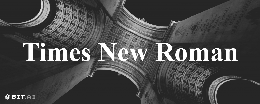
Times New Roman is a classic and best email font that is frequently used in printed materials such as books and newspapers. It has long been the preferred font for research papers.
It is a popular font choice for web users. One of the most well-known types in use, this email-safe font is a member of the serif font family. However, Times New Roman works well for your main email headings because of its small font size. The body of your message may be difficult to read if you choose this font.
But it has recently been viewed as somewhat out of date due to its extensive usage and status as the standard formal typography in the early 2000s. However, email marketing and branding can still benefit from Times New Roman.
4. Georgia

It is also one of the best fonts for email text. It gives your communications a trustworthy look. Because of this, books, newspapers, and other printed products frequently utilize the Georgia font. Its widely separated characters make emails easier to read, making it a best font for professional email.
This Microsoft typeface provides easy reading without eye strain, especially for lengthy email texts. Many companies, both startups and well-established ones, enjoy this font’s timeless look. For a modern, fresh style, you can also combine Georgia font with creative fonts.
5. Palatino

Palatino also belongs to the serif font family. It is perfect for reading lengthy paragraphs and is renowned for its elegant and sophisticated look. Its delicate strokes can make text look more elegant, making it also the best email font. The letterforms are balanced in Palatino, which enhances the readability. It is suitable for drafting reports, crafting newsletters, or formatting eBooks as it provides both style and clarity of text.
If we pair it with sans serif fonts, it offers versatility in the layout of the emails. It adds warmth to the content, which resonates with almost all types of text.
📌 Not sure how to style your fonts? Elink makes it simple
6. Trebuchet MS

Microsoft created this straightforward serif font, which is renowned for looking crisp and contemporary. It was easy to read at small sizes, but it is now a good option for headers and titles. Additionally, the font comes in a variety of weights to suit your particular application.
Trebuchet MS’s welcoming and casual style makes you seem more personable when sending emails, as it is the best font for Outlook email. This typeface is widely used in print and digital media as a substitute for Arial and Verdana.
7. Comic Sans

Each letter in the Comic Sans font stands out from the others, making it an excellent choice for dyslexics. This typeface is still helpful if you are writing for fun or want to appear amusing, even though it is generally seen as being out of style and ugly to look at. It is also used in digital media and printing for its elegant look. It is the popular choice among younger audiences due to its friendly appearance.
The informal tone of Comic Sans also helps soften serious messages and makes communication feel more personal. Additionally, it is readable at smaller sizes and ensures clarity across various platforms, from presentations to books.
8. Lucida

A simple sans-serif version of the Lucida typeface without bold or italic is called Lucida Sans Unicode. Both print and on-screen documents can be used with Lucida. This typeface is popular for websites because it looks classy and classic. It has clean and open letterforms that enhance readability even on low-resolution screens.
Lucida is also used in user interfaces and academic materials due to its professional look. It also supports multiple languages, which makes it more versatile on digital platforms.
9. Courier New

The best font for email content is Courier New. It belongs to the slab-serif family of serif fonts. It is frequently used for manuscripts and in-depth reports, and it resembles a classic typewriter typeface.
Numerous web pages and online sales catalogs utilize this incredibly readable font. Using Courier New as a digital font makes many people who were previously used to the Courier typewriter fonts feel comfortable. It’s also very email-safe.
10. Verdana

It was designed for screens with low resolution. Wide, readable characters in both uppercase and lowercase are used in the email copy. Additionally useful for crafting lengthy emails that are simple to skim due to the space between letters. Using it for your business email name is likewise a bold and appealing choice.
Web users love Verdana, especially when it comes to creating email messages. This font is highly praised and frequently used as a top email typeface because of its bold, simple lines that make it very readable.
Now, let’s get into more specific use cases where font choice matters.
Font Recommendations for Different Use Cases
Every part of your email serves a different purpose, and your font should align with that. So, here we’ve provided different use cases of email fonts.
Best Font for Email Signature
For choosing the best font for email signature, we advise choosing a web-safe typeface in addition to an alternate, email-safe font. Since most emails will probably look the same, you may make sure that your web-safe version and other alternatives look professional and consistent.
We suggest the following best fonts for email signatures:
- Arial
- Helvetica
- Tahoma
Best Fonts for Email Newsletters
Email newsletters frequently have to condense a lot of information into a short amount of space. We suggest the following newsletter fonts, if you have trouble with this when creating your campaigns:
- Raleway
- Oswald
- Tahoma
Worth a click👉 The Best Time to Send Newsletters for Maximum Engagement
Best Fonts for Business Emails
While some fonts are more professional, others are more silly, and others are distinct ones that strike a compromise between the two. For the most polished business email fonts, we suggest selecting typefaces that convey class and trust:
- Poppins
- Arial
- Helvetica
Of course, even the perfect font won’t help if your font size misses the mark.
Don’t Forget: Font Size Also Matters!
So now, after picking the perfect font, there’s one more thing you can’t afford to overlook: font size. Even the best-looking font won’t help if the size is too tiny to read or so big it looks awkward. The email font does not need to be too big or too small. For headings and body content, there are no set ideal font sizes. But the font you use for your emails should be at least 10 points and no more than 16 points.
A quick tip? Before sending an email to a group, spend some time sending it to yourself to make sure it is readable and of high quality. The ideal font size for emails can be found in this testing procedure.
Best Practices to Choose the Email Font
Now you can say that the message you wish to communicate will ultimately determine which fonts are appropriate for emails. The chosen typographic style should support and strengthen the main point of the message, not contradict it. Additionally, it should be consistent with your entire brand character and the perception you wish to leave on your target audience.
You can use Times New Roman for highlighting your annual performance or talking about your unique selling propositions. This best font for email commands attention and makes an impression. You can use Open Sans for presenting a line of products. Your readers are more inclined to read the email and click on the call-to-action buttons because of the friendly appearance of the design. For long newsletters, Arial is the best. When reading the long passages, readers will feel comfortable because it is the best font for email for its readability.
Wrapping Up
Finding the ideal balance between form and function is more important when choosing a font. Even while it can seem like a little element, how your message looks can have just as much impact as its content. So the next time you click “send,” ask yourself: Is my font making my message better or worse? That simple check might be all it takes to turn a good email into a great one.
Read More👉 Email Marketing Stats You Should Know for Your Next Campaign!
Choose the Best Font for Email using elink
We should never neglect the importance of font in effectively communicating a message through emails. Now it’s time to apply what you’ve learned to your marketing emails and select the ideal font, or even change your present font to one that better fits your brand.
One of the tools that can make this simpler and more professional is elink.io.
Elink.io is a robust, full-fledged content curation and newsletter-building tool specifically built for marketers, bloggers, teachers, and teams. Whether you’re crafting a clean newsletter, designing web pages, or sharing content curation, elink streamlines the process fast and pretty, without any coding or design knowledge needed. These are some of the best features of elink.io:
- Modern Fonts and Templates: Select from a large assortment of clean, professional fonts and amazing templates. Easily change them to suit your brand and save them for recurring campaigns.
- Drag-and-Drop Editor: Easily create and design newsletters with an easy drag-and-drop editor.
- Content Curation: Easily gather and share articles, blog posts, videos, or products by copying and pasting URLs. Elink converts them to great-looking content blocks instantly.
- Integration Ready: Easily integrates with tools such as Gmail, Mailchimp, and more for rapid publishing and sharing.
- Collaboration Features: Share with your team to co-create in real time, and it is ideal for agencies and marketing teams.
- Automated Updates: Build newsletters or web pages that automatically update when new content is published to your selected RSS feeds or bookmarked pages.
- Responsive Design: All newsletters and pages built with elink are mobile-optimized and responsive across devices.
If you need a tool that offers design versatility, content automation, and usability, elink.io is a great option to take your email marketing campaign to the next level.
FAQs
1. What is the best font to use in Gmail?
The top fonts for emails that make them readable and scannable are Arial, Georgia, Times New Roman, Verdana, etc.
2. Which font size works best for emails?
For desktop and mobile screens, we advise staying within the range of 22–28 pixels for headings and 12–14 pixels for the body.
3. Should we use the same font for headings and the body of emails?
It is recommended to use the same family of font in the email. You can make the headings bold if you want to differentiate them from the rest of the content.
4. Can we use decorative or cursive fonts in emails?
These type of fonts seems unprofessional and are not recommended for use in formal emails. But you can use them in personal or informal emails.
Keep reading and learning 📚
Email Etiquette: 17 Important Rules To Write A Professional Email!
Email Greetings to Use at Work & Stay Professional!
6 Ridiculously Simple Email Marketing Tips For Content Marketers!
Sales Email Subject Lines That Skyrocket Your Open Rates!
A Guide to Writing Fashion-Forward Email Newsletters