You hit send on the email.
It lands in your subscribers’ inboxes.
A few people open it… and then nothing happens.
No clicks. No traffic. No action taken.
That’s the frustrating part of email marketing, which no one talks about enough. Seeing your email open feels good, but clicks are where we actually move leads, sales, and conversations forward with the audience.
When subscribers don’t click, the journey ends right there in the inbox instead of continuing on your website, landing page, or product demo.
The good news? Click-through rate isn’t some mysterious metric that only improves with luck or fancy tools. Most of the time, low clicks come down to a few fixable issues: unclear messaging, too many links, weak calls to action, or emails that ask too much from the reader.
In this guide, we’ll break down 15 practical, proven tips to improve your email click-through rate—things you can apply immediately, whether you’re sending newsletters, product updates, or promotional emails. No tricks. No hype. Just what actually helps people click.
Before we get into the tips, let’s slow down for a second and understand what email click-through rate really means.
What is an Email Click-Through Rate?
Email click-through rate (CTR) tells you what happens after someone opens your email. It measures how many readers actually took the next step and clicked a link inside the message.
In simple terms, it tells you whether your email convinced readers to take the next step.
If 100 people open your email and 5 of them click a link, your click-through rate is 5%. That’s it. No complicated math, no hidden meaning.
What makes CTR truly valuable is what it reveals about your audience. A click shows that your content was clear, your message made sense, and the reader was motivated to take the next step, whether that’s visiting a website, going to sign up for a newsletter, downloading a guide, or making a purchase.
On the other hand, an “open” only shows that someone viewed your email in their inbox. It doesn’t tell you if they actually cared about the content or took any action. Clicks, however, show genuine intent and engagement.
That’s why marketers care so much about CTR. It’s the bridge between sending emails and getting real results: traffic, sign-ups, downloads, or sales.
Now that you know what email click-through rate actually measures, let’s look at what you can do to improve it, step by step.
Read More: The Most Important Email Marketing Metrics to Check
15 Practical Tips that can help boost your email CTR
Improving your click-through rate isn’t about luck or gimmicks. It’s about being clear, staying focused, and really understanding what makes your audience take action.
With that in mind, let’s jump into 15 practical tips that can help boost your email CTR, starting with the very first step.
1. Write Subject Lines That Set the Right Expectation
Your subject line is the very first impression your audience gets, and it determines whether they even see what’s inside your email. In fact, nearly 47% of people decide to open an email based on the subject line alone, showing just how important those first few words really are.
But a good subject line does more than just get opens. When your subject line clearly reflects the content and value inside, it sets the right expectation from the start.
That means people aren’t disappointed when they open your email, and they’re far more likely to click the links inside because they already know what to expect.
Here’s how to craft subject lines that actually lead to clicks:
Tips for better subject lines
✔ Keep it clear and specific, tell readers what to expect.
✔ Give Your Audience the Value/Benefit They’ll Get From Reading!
✔ Use numbers or urgency when relevant (like “3 ways to…” or “Before midnight…”).
✔ Avoid vague clickbait; being honest builds trust and engagement.
✔ Try A/B testing to see what resonates most with your audience.
When your subject line sets the right expectation, clicks naturally follow because readers know exactly what they’ll get next, making them far more likely to take action.
2. Make One Clear Goal Per Email
One of the main reasons emails fail to get clicks is that they try to do too much at once. When readers aren’t sure what action you want them to take, they often end up doing nothing at all. Emails that focus on a single, clear goal perform far better.
The key is to make every part of your email: subject line, headline, copy, images, and CTA align with that one smart goal. If you want people to sign up for a webinar, every sentence and link should guide them toward that action.
Adding extra links or unrelated content only confuses the reader and dilutes your chances of a click. By keeping your emails focused, you make it obvious what the next step should be, and readers are far more likely to take it.
👉 Remember: Less choice = more clicks.
Quick Tips: Research shows that campaigns with one primary objective can see up to 371% more clicks than emails that try to cover multiple topics in a single message.
Read more: Newsletter Subject Lines: How to Write Them, Examples & Tips!
3. Use a Single, Strong Call-to-Action (CTA)
There is nothing worse than sending out an email that is incredibly well written but leaves readers unsure of what to do next after reading the email.
That’s where a strong call-to-action, or CTA, comes in. It’s not just a button or a link, it’s the moment that guides your reader toward the next step, whether that’s downloading a resource, signing up, or making a purchase. The key is to stick to one clear action per email.
The words you use for your CTA matter more than most people realize. An easy and straightforward call to action is “Download Your Guide”, “Reserve Your Spot”, or “Get Started Now”, because they tell people precisely what to do next without any need for guessing or additional thinking.
Readers can easily click when there is a clear and natural CTA. Just this simple clarity can create a real action from a skimming reader, helping your message actually achieve its goal instead of just sitting in someone’s inbox.
4. Place Your CTA Where It’s Impossible to Miss
It doesn’t matter how good your CTA is if people can’t see it. The placement is everything. Ideally, the main call-to-action should be near the top of your email so readers see it right away, without having to scroll.
But that doesn’t mean it should only appear once; if your email is long, repeating it in a natural spot can make a big difference.
Think about it like this: When you open an email, you want to see right away what you’re supposed to do next. A well-placed call-to-action makes that obvious without feeling pushy. It’s just a clear guide pointing the reader in the right direction.
When the next step after reading the email is easy to spot and understand, clicking becomes second nature, and suddenly your email isn’t just being read, it’s actually getting results.
Read More: The Best Newsletter CTA Formulas (That Actually Get Clicked)
5. Write Copy Like a Real Human, Not a Brand Brochure
A common error that many people make in email marketing is creating email content that sounds robotic or reads like a stiff marketing brochure.
People don’t respond to corporate-speak or over-polished sentences; they respond to real human voices. Write your emails like you’re talking to a friend. Use short sentences, everyday words, and a conversational tone.
For example, rather than saying something formal like “Our product delivers unmatched efficiency,” try something more natural: “This tool just makes life a little easier, no stress, no fuss.” It’s relatable, easy to read, and makes it feel like there’s a person behind the message.
When your emails sound human, readers trust them, engage with them, and actually click on your links. The goal here is not simply to create friendly-sounding emails; instead, you want to create a clear, engaging, and compelling email that develops reader interest to take the next step.
6. Personalize Beyond First Names
Adding a first name to an email is easy. Everyone does it. And most readers don’t even notice it anymore. If that’s the only personalization you’re using, your emails will still feel generic.
What does make a difference is sending emails that match what someone actually cares about because they are based on their behaviors. E.g., What did they subscribe to? What links have they clicked? What content have they been interested in enough to view/visit, but then left? These types of bases provide a far better indication than just a name.
Let’s say when someone downloads a basic guide from your website, sending them complex strategies immediately is not going to be beneficial and will not generate any interaction.
It is far better to send a follow-up message with basic steps or further information that relates to the guide they received, as this is logical and user-friendly. The same idea applies to product emails.
If someone checked out a product but didn’t buy, a quick reminder, a short tip, or a customer example can be enough to bring them back.
You don’t need fancy automation or complex data to do this well. Even basic segmentation goes a long way. Group people by interest, action, or stage, and adjust the message slightly. Those small changes make emails feel more relevant, and relevant emails get clicked.
Ultimately, personalized marketing does not seek to impress anyone. It just respects the reader’s time. When an email clearly connects to something they did or wanted, clicking feels like the obvious next step.
Read more: Influencer Outreach Email: How to Write One (+ Templates)
7. Keep Emails Short and Skimmable
Think about how you read emails yourself. You don’t sit back and carefully read every word. Most of the time, you open the message, glance through it, and decide within seconds whether to keep going or move on. Your subscribers do the same.
Because of that, long emails work against you. The more text people see, the easier it is to feel overwhelmed. Shorter emails feel lighter and easier to digest, which makes readers more willing to stay and scroll. Instead of trying to say everything at once, focus on one clear point and build around it.
Once you’ve cut things down, how the email looks becomes just as important as what it says. Large blocks of text are hard to read, especially on mobile.
Breaking your message into small paragraphs gives the reader room to breathe. Simple sentences help too. If someone can understand your message by quickly scanning it, you’re on the right track.
From there, make sure the email leads to a single action. One link. One idea. One next step. When an email tries to push too many things at once, readers hesitate, and hesitation usually means no click at all.
Keeping emails short and skimmable isn’t about rushing or cutting corners. It’s about making things easy for the reader. When your message feels clear and effortless to read, clicking becomes the natural next move.
8. Use Buttons Instead of Plain Text Links
When you send an email, you usually want the reader to do one thing: click. So that action should be easy to see and easy to understand. This is where buttons work better than plain text links.
Text links often blend into the rest of the email. If someone is skimming, they can miss them completely. Buttons stand out right away. They visually separate the action from the rest of the content, so readers don’t have to search for what to do next.
Buttons are also more practical, especially on mobile. Most people read emails on their phones, and tapping a button is much easier than trying to hit a small text link. Fewer missed taps means fewer lost clicks.
That doesn’t mean every link in your email needs to be a button. But your main call to action should be. Whether you’re sending readers to a blog post, a product page, or a signup form, a clear button removes doubt and makes the next step obvious.
In the end, buttons don’t just look better, they make clicking feel simple. And when the action is simple, more people follow through.
Read More: How to Improve Newsletter Design for Better Engagement
9. Design Emails for Mobile First
More and more people check their email on their phones. In fact, around 60% of all emails are opened on mobile devices these days, which means most of your audience probably reads your email on a small screen first.
Because of this, making your emails mobile-friendly isn’t optional; it’s essential. If your email appears attractive on the desktop, but looks disorganized or unclean when viewed on a mobile device, most likely, people will not take the time to scroll or click.
To ensure the best user experience, always consider what your content looks like on a mobile device first. Is the text big enough to read without zooming? Do your buttons stand out and are easy to tap? Do images resize correctly, or do they cut off awkwardly? If readers have to pinch, zoom, or squint, they’ll likely lose interest before your message even lands.
One of the easiest rules to follow is to keep your layout simple. One column is almost always better than two on mobile. Short paragraphs and large buttons make actions obvious. Because screens are small, clutter gets confusing fast, and confused readers don’t click.
The reason this matters isn’t just about design. People spend more time reading and understanding the content of an email that looks good and is formatted for mobile compared to those that do not; therefore, they are more likely to take action (click your call-to-action) when they receive an email designed for mobile devices.
Since so many opens happen on phones, designing with mobile first helps you reach more real people instead of losing them to frustration.
Being mobile-first isn’t some trendy buzzword; it’s just good email sense in a world where most of us spend our day on our phones.
10. Add Visuals That Support the Click (Not Distract From It)
Images can be helpful in emails, but only when they’re used the right way. The goal isn’t to decorate the email. The goal is to help the reader take action.
A good visual makes your message clearer. It can show what you’re talking about or give a quick idea of what happens after the click. For example, a product image or a small preview can help readers understand why they should click without needing to read too much.
However, too many images can do the opposite. When an email is full of big graphics or banners, readers get distracted. Instead of clicking, they scroll past or close the email. If an image doesn’t help the main message, it’s better to leave it out.
Where you place visuals also matters. Images work best when they sit close to your call-to-action button. This way, the reader’s attention naturally moves from the image to the click. Random images placed in between text can break the flow and confuse the reader.
In simple terms, images should help your reader, not fight for their attention. When a picture clearly backs up your message and leads toward one simple action, people click without even thinking.
Read More: 3 Reasons Why Visual Content Marketing Is Better Than Boring Text
11. Match Email Content to Landing Page Message
There is nothing that frustrates a reader more than clicking a link in an email and ending up somewhere completely different from what they expected.
If your email promises one thing but the landing page shows something else, people are likely to leave immediately, and your click-through won’t mean much.
The key is consistency. Make sure the headline, offer, and overall message in your email match what’s on the landing page. For example, if an email’s title is like “A Free Guide to Beginner Photography,” then the landing page linked in this email should prominently feature that same guide when someone clicks on it.
Don’t switch topics or bury the main point in extra content. The reader clicked that link for a reason, and that reason should be front and center.
This alignment also builds trust. When people see that your email delivers exactly what it promised, they feel confident and are more likely to take action. It also reduces confusion and keeps the path to conversion simple.
In short, your email and landing page should feel like two parts of the same conversation. When the message is seamless from inbox to webpage, readers are more likely to follow through and click, and your campaigns perform much better.
12. Create Urgency (Without Pressure)
Sometimes, all it takes is a little nudge to get someone to click, but you don’t want to push too hard. People can feel when an email is being forceful, and that usually makes them scroll past. The trick is to show that the opportunity is limited without making the reader feel stressed.
A simple way to do this is with deadlines or availability. For example, “Offer ends Friday” or “Just a few spots left” works better than anything dramatic. It gives readers a reason to act without shouting at them. Pair that with a clear next step, like a button or link, and it’s easy for them to respond.
The key is to make urgency feel natural. When readers see that acting sooner is useful or convenient, they’re more likely to click, but if it feels like pressure, they’ll ignore it. Done right, a little urgency can guide people to action without making them uncomfortable.
Pro Tip: Use subtle cues like countdown text or limited-time labels placed near your action buttons to spark quick decisions. When urgency feels helpful, not pushy, clicks happen naturally.
Read more: How to Boost Email Deliverability: 10 Proven Strategies
13. Test CTA Copy, Not Just Colors
A lot of people think improving click-throughs is all about button colors. Sure, a bright button can help, but what really makes readers click is what the button says. The words you use matter more than the shade of blue or red.
Instead of just swapping colors, try testing different phrases on your call-to-action (CTA). For example, “Download Your Free Guide” might get more clicks than just “Download Now.” Or “Start Learning Today” might feel more inviting than “Sign Up.” A little bit of change in words can make a big difference because they speak directly to what the reader wants.
The key is clarity and relevance. Your CTA should make it obvious what happens after the click. Confusing or vague buttons make people hesitate. And hesitation almost always means no click.
So, next time you want to improve click-through rates, don’t just tinker with design. Experiment with the words themselves. By utilizing various phrases and finding the one that connects best with your target market, you’ll gain valuable experience and knowledge.
14. Send Emails at the Right Time for Your Audience
Timing matters more than most people think. Even the best email can get ignored if it lands when your audience isn’t ready to read it. Sending at the right moment makes it easier for people to notice, engage, and click.
The trick is knowing your audience’s habits. Are they checking emails in the morning with their coffee? Or are they more active in the evening after work? It might take some testing to figure this out, but even small adjustments can make a big difference.
Also, consider time zones. If your audience is spread across the country or the world, sending all emails at once might mean some people see them in the middle of the night. Segmenting by time zone can help your message reach readers when they’re most likely to open it.
Remember, “right time” isn’t about convenience for you, it’s about convenience for your readers. If the time an email lands in a person’s inbox aligns with what they would typically do at that moment in time, then that person will be more inclined to open, read, and click on it. Timing is very subtle, yet it can produce enormous results.
15. Track, Learn, and Improve Every Campaign
Sending an email and moving on isn’t enough if you want better results. The real improvement happens after the campaign goes out.
Take a few minutes to look at what actually happened where people clicked, where they didn’t, and which links got ignored completely. That information is gold.
Maybe one email got plenty of opens but very few clicks. That usually means the content didn’t match what the subject line promised.
Another email might have fewer opens but strong clicks, which tells you the message and CTA worked well for the people who saw it. Small details like these help you understand what your audience responds to.
You don’t need complex reports or fancy tools. Just pay attention, make small changes, and test again. Over time, these tiny improvements stack up. That’s how email campaigns get better, not by guessing, but by learning from every send and doing the next one a little smarter.
Read More: Campaign Monitor Newsletter: How to Create it in 10 Minutes?
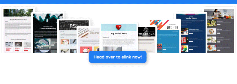
Bonus Tip: Use elink.io to Create Click-Worthy Email Content (Without Starting From Scratch)
elink.io is a content creation and newsletter tool that helps you turn links, articles, videos, and resources from around the web into attractive email newsletters or web content in minutes.
Instead of spending hours formatting and designing every email by hand, you collect the links you want to share and elink converts them into visual blocks with titles and images, ready to look great in any email platform.
Key Features of elink.io for Email Creation
🔸 Curate Content Quickly
You can save and organize links with elink’s Chrome extension, RSS feed reader, or bookmark library. These saved links become the building blocks of your newsletter, so you don’t have to start from scratch each time.
🔸 Automatic Visual Layouts
Once you add links, elink automatically turns them into visual content blocks with images, titles, and short descriptions. That means you get a clean, magazine-style look without doing much formatting yourself.
🔸 50+ Beautiful Newsletter Templates
You can choose from dozens of layouts that are already tested to look good on phones, tablets, and desktops. This makes your email easier to read and more likely to get clicks.
🔸 Customize Your Voice and Design
You’re free to edit the title, description, and visuals for each link so your newsletter sounds like you. Fonts, colors, and headers can be adjusted to match your brand or style.
🔸 Works With Any Email Provider
You can export your newsletters as HTML format or send it via email service providers like Gmail, Mailchimp, ActiveCampaign, and many others that accept HTML newsletters. This means you can retain your current email workflow while having added flexibility!
🔸 Responsive and Tested Design
elink’s templates are tested across over 90 email clients, so your newsletter will look clean and professional whether people open it on mobile or desktop.
Using elink.io saves time, keeps your emails visually appealing, and helps you send content that’s easy for readers to navigate, all of which can help increase engagement and click-through rates without exhausting your creative energy
Final Thoughts: Improving Email CTR Is About Clarity, Not Tricks
Improving your email click-through rate doesn’t require hacks, shortcuts, or clever tricks. It comes down to one simple thing: making it easy for people to understand what you’re offering and what they should do next.
Clear subject lines, focused messages, and thoughtful CTAs go much further than flashy tactics ever will.
This is also where the right tools can quietly make a difference. For example, using a tool like elink.io for email creation helps keep things clean and organized.
Instead of stuffing too much into one email, you can curate content neatly, structure it well, and guide readers toward a clear next step without overwhelming them. When your email looks clear and feels intentional, people are naturally more likely to click.
At the end of the day, Focus on small improvements, learn from each send, and adjust as you go. That steady approach is what actually leads to better click-through rates over time.
FAQs
What is a good click-through rate for email?
A good email click-through rate usually falls between 2% and 5%. That said, what’s “good” really depends on your audience and the type of email you’re sending.
What is the average click-through rate?
Across most industries, the average email click-through rate is around 2–3%. Some industries do better, some lower, but averages are just a reference point. If your CTR is slowly improving over time, that’s usually a better sign than hitting an industry number once and then dropping again.
How can subject lines affect email click-through rates?
Subject lines set the expectation for what’s inside your email. If the subject line is clear and matches the message, readers are more likely to trust the email and click through. On the other hand, vague or misleading subject lines may get opens, but they often lead to fewer clicks because the content doesn’t feel aligned.
How does personalization increase email click-through rates?
Personalization helps because the email feels relevant to the reader. When content matches their interests or past actions, it feels useful rather than generic, which naturally makes people more likely to click and engage.
Keep Reading & Learning 📚
- How To Create Marketing Landing Pages in Easy Steps
- How to Use Email Marketing for Effective Content Distribution
- 20 High-Converting Email Newsletter Examples You Need to See
- How to Start Email Automation: Best Tools & Tips
- Email Personalization Best Practices Every Marketer Should Follow