
“Intuitive design is how we give the user new superpowers.”
– Jared Spool
Do you remember the shrunken version of a website that you opened on your mobile phone, and you had to pinch and zoom to see things?
A horrible experience, wasn’t it?
The point being, even though a website works perfectly on a desktop, doesn’t mean it’ll render perfectly on other devices as well…and that’s a problem.
According to a survey 40% of users hit the back button and went to a competitor’s website after a poor mobile experience.
A responsive web design isn’t a choice anymore. In today’s era, you have to create a consistent, yet tailored, experience for your users across every device – including the ones that are yet to be released. Putting all your content into one column and calling it quits isn’t going to work anymore.
The fact is, if you don’t have a responsive design, you will lose out on leads and sales. If you design websites that can adapt to any device, you can future-proof your work.
Still not convinced?
Well, in 2015, google started factoring in a website’s mobile presence as a ranking criterion. This fact alone justifies how important a responsive design is.
In this article, we’ll explore everything you need to know about responsive web design. So, buckle up, because you’re in for a ride!
Responsive Web Design: What Is It?
Before we move ahead with the nitty-gritty of responsive web designs, you should know that the term was coined in 2010 by Ethan Marcotte.
He said, “Rather than tailoring disconnected designs to each of an ever-increasing number of web devices, we can treat them as facets of the same experience. We can make our designs more adaptive to the media that renders them.”
In simpler words, responsive design is an approach where a web page “responds” to different screen sizes and creates a consistent user experience.
It doesn’t matter whether you’re using a traditional desktop or a tiny smartphone, a responsive device will make all website elements smartly adapt to the device’s resolution and capabilities.
That means, all the elements on the webpage will shrink or grow, move or rearrange, according to the device you’re using. The text on the screen would neither be too small or too big, the images would look perfect and the tabs would be positioned perfectly!
As a result, there’ll be less confusion, smooth navigation, more sales, and business growth.
Let’s explore a few more reasons why you should be using a responsive web design.
Read more: How to Create a Custom Social Media Wall for Your Website?
Reasons Why You Should Be Using a Responsive Website Design
1. Seamless User Experience
We’ve all heard it a thousand times – the first impression is the last impression, and when it comes to websites, this becomes even more true.
When someone is visiting your website for the first time, you want them to have a good experience, right? If they have to do a lot of pinching and zooming, they’ll probably not stick around and go to another website.

So, to make sure that you don’t lose out on your visitors, you need a responsive web design.
If you have a responsive design, users will always be able to smoothly navigate through your website, no matter which device they are using.
The best part is, a responsive design doesn’t just satisfy the users, they are rewarded by Google with better search engine rankings as well. We’ll talk about this in detail later.
2. Lower Cost & Website Maintenance
Let’s face it.
It would be much better and easier to handle one responsive site as compared to handling two versions of the same website.
Having a separate desktop and mobile website would mean two administrative interfaces, two content strategies, and probably two design teams as well.
If you use a responsive website, you’ll have to spend less time on maintenance and you’ll get some breathing space to focus on other aspects of your business.
Responsive design’s “one size fits all” ideology means less headache for everyone – be it business owners, developers, or consumers.
3. Google Loves Responsive Design
Google pays attention to user behavior. If a visitor leaves your website quickly, google interprets it as a signal that the searcher didn’t really find anything relevant on your website.
The end result? Your website will be buried in the search engine results pages (SERPs).

However, users aren’t interested in just the content. In fact, on many occasions, design prevails over content. Your content might be magnificent, but if the design prevents a clean & undistracted environment, users will leave your site.
In short, the ‘user-focused’ experience, along with quality content, could improve your dwell time. A responsive design ensures that a user will stick around, giving a remarkable boost to your SERP rankings.
Read more: Best Website Widgets That Can Drastically Improve Your Website!
4. More Mobile Visitors
Let’s take a look at these stats first:
- There are currently 3.5 billion smartphone users worldwide.
- The total number of people using phones worldwide is 4.8 billion, which means nearly 73 percent of them use smartphones.
- 70% of web traffic comes from mobile phones.
- By 2025, 72% of people will access the internet using their mobile phones only.
- 90% of users make buying decisions through their mobile devices.
- 47% of US smartphone users say they couldn’t live without their devices.
A little shocking, right?
The landscape is shifting, probably faster than we might want it to. Within three to five years, mobile browsing is expected to outrun desktops. The world is gravitating towards mobile phones and this trend is not ending any time soon.
In light of this, a responsive web design is what you need. It doesn’t just offer a simple mobile template, instead, your entire site layout becomes flexible and fits into all screen resolutions.
You’ll probably miss out on opportunities to convert your visitors into buyers if your website is unresponsive or unsuitable for mobile phones.
A responsive web design is a work of art and it includes many intricacies. Fortunately, it is now easier than ever to implement because there is a tool out there that can help you create one within minutes.
Let’s check it out!
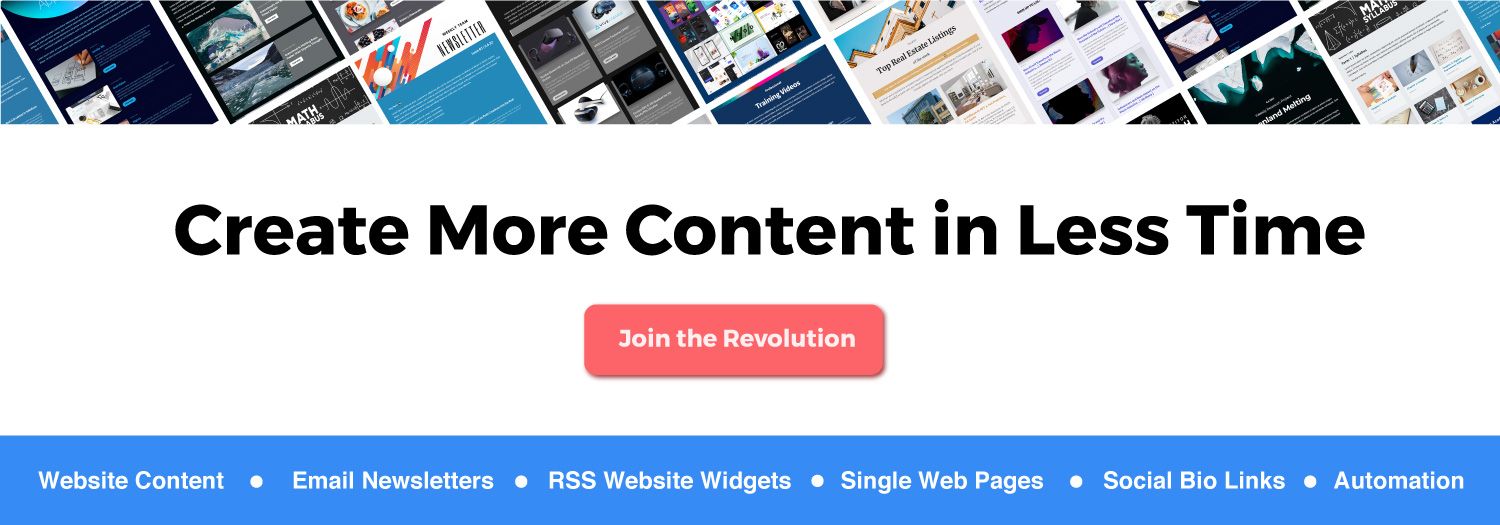
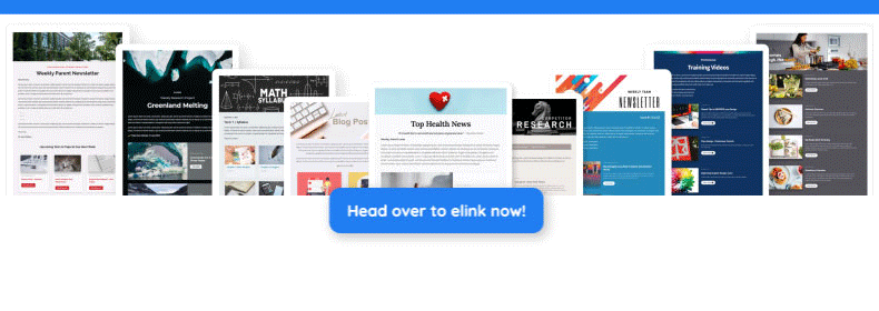
Elink.io – The Best Tool On The Planet To Create Responsive Web Pages

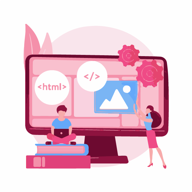
Optimizing your website for every single device is a daunting task, especially when you aren’t tech-savvy and you don’t have the budget to hire a designer.
An amazing all-in-one content curation tool, elink.io makes the entire process of creating beautiful and responsive webpages for your website a breeze. Whether you want to create a press page, resources page, product page, elink has got your back. Click here to see what you can create with elink.
Here’s what you have to do: Simply collect links from anywhere on the web and Elink.io will automatically convert those link collections into visual content that you can embed on your website. Elink page are fully responsive so the design will adjust to different devices automatically,
The tool offers over 50 pre-built templates, which means that you don’t have to think about the design aspect and you can focus on growing your business.
Key features:
- Offers 50+ beautiful prebuilt, fully responsive layouts.
- Turns any link (products, articles, videos, social media posts, etc.) into visual content in seconds.
- Customize each visual link’s title, description, and image.
- Build content automation workflows.
- Track how your content performs via engagement levels.
Final Words
“Your website is the center of your digital eco-system, like a brick and mortar location, the experience matters once a customer enters, just as much as the perception they have of you before they walk through the door.” – Leland Dieno
This quote correctly portrays how important user experience is. However, when it comes to web designing, it’s becoming impossible to keep up with the never-ending digital inventions and resolutions. It is difficult, or at least impractical, to build a website version for every new device and resolution.
Therefore, it becomes essential to use responsive web designs, so that you don’t have to suffer the consequences of losing visitors!
In order for your business to stay relevant, you need to have responsive designs and optimize user experience on tablets, smartphones, and every device imaginable.
Well, now that you how important it is to create responsive web designs, are you ready to create one using elink.io? Let us know how it goes by tweeting us @elink.io.
Good luck!
Further reads:
Create Grid Layouts for Webpages in 5 Simple Steps!
24 Shocking Digital Marketing Stats for 2021
How to Display RSS Feeds in your WordPress Website?
11 WordPress Widgets to Make Your Website Even Better!
24 Essential Wix Apps for Websites in 2021!
Grid Generator: What is it & How to Use it to Create Grid Layouts?